Loading…
Creator · MotionSites
View original source ↗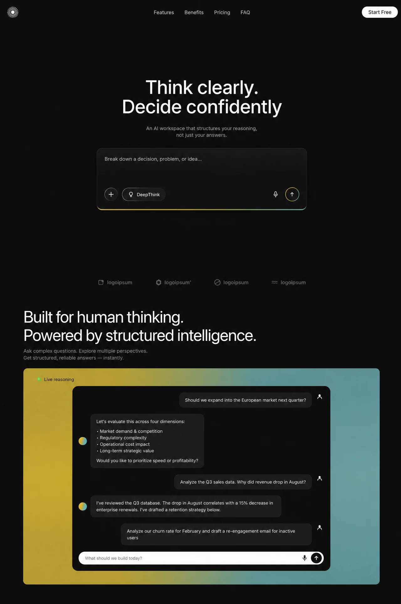
Prompt
Recreate this page EXACTLY as a single static HTML file (no frameworks, no React, no Tailwind, no GSAP). Two full-viewport dark sections stacked vertically. Smooth scroll. Antialiased text. Reference canvas feel: polished AI product landing, near-black #0c0c0c.

════════════════════════════════════
EXTERNAL ASSETS (ONLY THESE)
════════════════════════════════════
Fonts (must load exactly):
- Preconnect: https://fonts.googleapis.com
- Preconnect: https://fonts.gstatic.com (crossorigin)
- Stylesheet: https://fonts.googleapis.com/css2?family=Inter:wght@400;500;600&display=swap

Section 1 font stack: "Inter","Helvetica Neue",Arial,system-ui,sans-serif
Section 2 font stack: -apple-system,BlinkMacSystemFont,"Helvetica Neue","Segoe UI",Arial,sans-serif

NO external images, videos, favicons, JS libraries, or CDN icon packs. All marks are inline SVG. Logo rays are generated at runtime with JS (24 radial lines).

════════════════════════════════════
PAGE TITLE / META
════════════════════════════════════
<title>Think clearly. Decide confidently</title>
viewport: width=device-width, initial-scale=1, viewport-fit=cover
html lang="en", base font-size 16px, scroll-behavior:smooth (auto if prefers-reduced-motion)

════════════════════════════════════
GLOBAL / BODY
════════════════════════════════════
body background #0c0c0c, color #fff
body.menu-open { overflow:hidden } when mobile menu open

════════════════════════════════════
SECTION 1 — HERO (class section-one, id="home")
min-height: 100dvh, background #0c0c0c
CSS variables (exact):
--bg:#0c0c0c
--box:#111111
--hairline:rgba(255,255,255,0.065)
--heading:#fafafa
--subtitle:#9e9e9e
--nav:#bcbcbc
--placeholder:#aeaeae
--chip-fill:rgba(255,255,255,0.028)
--chip-border:rgba(255,255,255,0.30)
--chip-edge: linear-gradient(135deg,
  rgba(255,255,255,1) 0%,
  rgba(255,255,255,0.94) 22%,
  rgba(255,255,255,0.44) 38%,
  rgba(255,255,255,0.28) 50%,
  rgba(255,255,255,0.11) 63%,
  rgba(255,255,255,0.04) 75%,
  rgba(255,255,255,0.02) 100%)
--icon:#e8e8e8
--mic:#e1e1e1
--strip:#5c5c5c
--grad: linear-gradient(90deg,
  rgba(255,232,120,0) 0%, #ffe776 6%, #ffd400 26%, #ffd000 42%,
  #c9c93c 60%, #86ca8a 74%, #78d0cd 88%, rgba(120,208,205,0.55) 100%)
--grad-solid: linear-gradient(90deg,
  #ffe776 0%, #ffd400 22%, #ffd000 40%, #c9c93c 60%, #86ca8a 76%, #78d0cd 100%)

Layout shell (.page):
min-height 100dvh, flex column
padding: clamp(14px,1.55vw,26px) clamp(16px,1.7vw,28px) 0

–––– NAV TOPBAR ––––
3-column grid: 1fr auto 1fr (desktop)
LEFT: logo link href="#home" aria-label="Home"
Logo SVG viewBox="0 0 52 52":
- empty <g class="rays" stroke="#f4f4f4" stroke-width="1.4" stroke-linecap="round">
- white circle cx=26 cy=26 r=7.4 fill="#fbfbfb"
JS fills rays: 24 lines, center 26,26, inner radius 10.4, outer 22.6, angles from -π/2 around full circle
Logo size: clamp(34px,3.1vw,52px)

CENTER nav links (ul.nav-links), gap clamp(1.6rem,2.63vw,2.75rem):
Features → #features
Benefits → #benefits
Pricing → #pricing
FAQ → #faq
Link style: color #bcbcbc, weight 400, size clamp(1rem,1.435vw,1.5rem), letter-spacing 0.005em, hover #f2f2f2, transition color .18s ease

RIGHT: white pill button "Start Free"
bg #ffffff, text #0c0c0c, weight 500, border-radius 999px,
padding clamp(0.55em,0.9vw,0.62em) clamp(1.1em,2vw,1.35em),
hover bg #ededed, active scale(.98)

Burger (≤1024 only): 3 hairline bars, morphs to X when aria-expanded=true

–––– HERO COPY ––––
Centered flex column
H1 (weight 500, color #fafafa, line-height 1.04, letter-spacing -0.021em,
font-size clamp(2rem,5.263vw,5.5rem); desktop ≥1025: clamp(3.25rem,4.6vw,4.75rem)):
TWO masked lines (NOT a single br):
  Line1: "Think clearly."
  Line2: "Decide confidently"
Structure each line as:
<span class="hl-mask"><span class="hl-line">…</span></span>
.hl-mask: display block; padding-bottom 0.16em; margin-bottom -0.16em
(during entrance overflow:hidden on mask)

Subtitle (data-enter), color #9e9e9e, weight 400,
size clamp(0.95rem,1.435vw,1.5rem), line-height 1.3, letter-spacing 0.004em,
margin-top clamp(1.1rem,2.9vw,3rem):
"An AI workspace that structures your reasoning,<br>not just your answers."
(On ≤680px: hide the <br>, width min(100%,22rem))

–––– COMPOSER CARD ––––
.composer-shell: full width, centered, isolation:isolate, transform translate3d(0,0,0)
.composer: width clamp(300px,55vw,913px) (desktop ≥1025: clamp(560px,52vw,820px); tablet: clamp(320px,72vw,760px); mobile: 100%)
margin-top clamp(1.2rem,2.9vw,3.05rem)
bg: linear-gradient(180deg,rgba(255,255,255,0.028),rgba(255,255,255,0) 42%), #111111
border 1px solid rgba(255,255,255,0.065)
radius clamp(14px,1.32vw,22px)
box-shadow: 0 2px 40px rgba(0,0,0,0.45), inset 0 1px 0 rgba(255,255,255,0.04)
padding clamp(16px,1.9vw,32px)
min-height clamp(150px,17.2vw,288px) (desktop: clamp(170px,15vw,250px))
flex column

INSIDE composer:
1) .composer-glow (absolute, z-index -1, behind card but above section via isolation):
   left/right/top 0, bottom calc(-1 * clamp(3px,0.35vw,6px))
   border-radius inherit, background --grad-solid, filter blur(0.4px), opacity 0.95
   Creates yellow→teal underglow hugging bottom edge of composer

2) Placeholder text: "Break down a decision, problem, or idea…"
   color #aeaeae, size clamp(0.95rem,1.435vw,1.5rem)

3) Controls row (margin-top auto, flex, gap clamp(8px,1.08vw,18px)):
   a) ROUND + chip button (aria-label "Add attachment"):
      size clamp(38px,3.23vw,54px), circle, white + icon SVG path M12 5v14M5 12h14, stroke 1.9
      chip fill + masked 1px gradient ring via ::before with --chip-edge (mask-composite xor/exclude); flat border fallback
   b) DeepThink pill chip: lightbulb SVG + label "DeepThink"
      height same as round, radius 999, padding 0 clamp(12px,1.4vw,23px), text white ~clamp(0.9rem,1.316vw,1.375rem)
   c) spacer flex 1
   d) Mic button (no chip ring): mic SVG, color #e1e1e1
   e) SEND button (the only continuous ambient motion):
      size clamp(40px,3.35vw,56px), circle
      --send-ring: clamp(1.1px,0.092vw,1.53px)
      padding = ring thickness; outer bg --grad-solid
      ::before absolute inset 0 circle with same --grad-solid (animated layer)
      INNER .send-inner: flex 1, circle, bg #141414, up-arrow SVG stroke #fafafa ~44% size
      hover: filter brightness(1.08); active: scale(.95)
      AFTER hero entrance completes (html.hero-ready): animate ::before with
      @keyframes send-ring-sweep { from rotate(0) to rotate(360) }
      10s linear infinite — gradient light sweeps around ring; button body never moves

–––– TRUST LOGOS FOOTER ––––
4 brands in a row (≤600px: 2×2), color #5c5c5c, gap clamp(1.6rem,5.6vw,5.9rem)
Each: small SVG mark + word "logoipsum" (2nd has ® superscript)
All placeholder logoipsum marks (inline SVG only — no logo URLs)

–––– MOBILE NAV OVERLAY (≤1024) ––––
Fixed fullscreen dialog #navOverlay
bg: radial yellow/teal tint + dark translucent gradient
backdrop-filter: blur(22px) saturate(120%)
opacity 0 / hidden → .open: opacity 1, transition .34s
Links: Features, Benefits, Pricing, FAQ — huge type clamp(2rem,9vw,3.4rem) weight 500
Staggered fade+lift on open (delays .08/.14/.20/.26s), ease cubic-bezier(.22,1,.36,1)
Hover underline grows with --grad (transparent→yellow→teal)
Footer: 2px --grad bar + full-width white "Start Free" CTA
Burger/Escape/resize>1024 closes menu

════════════════════════════════════
SECTION 2 — FEATURES (class section-two, id="features")
════════════════════════════════════
min-height 100dvh, bg #0c0c0c
padding: clamp(20px,3.2vh,42px) clamp(16px,6vw,91px) clamp(16px,2.4vh,32px)
On desktop ≥1025: padding-top clamp(130px,12.6vw,210px) — deliberate pause after logos
wrap max-width 1300px

Variables:
--heading:#ffffff
--subhead:#8b8b8d
--panel-bg:#0d0d0d
--bubble-bg:#1c1c1c
--msg-text:#efefef
--reason-text:#0b0c07
--green:#23d92c
--input-bg:#fdfdfd
--placeholder:#6b6b6d
--send-bg:#0c0c0c

H2 (weight 400, letter-spacing -0.02em, size clamp(1.6rem,4.1vw,3.3rem), line-height 1.11)
TWO masked lines:
  "Built for human thinking."
  "Powered by structured intelligence."

Subcopy (data-enter):
"Ask complex questions. Explore multiple perspectives.<br>Get structured, reliable answers — instantly."
color #8b8b8d, size clamp(0.82rem,1.25vw,1.125rem)
(hide on max-height 520px)

GRADIENT PANEL (.panel):
border-radius clamp(10px,1vw,14px)
EXACT multi-layer background:
radial-gradient(120% 150% at 9% 52%, #d2ae1a 0%, #bf9f28 22%, rgba(175,155,55,0) 56%),
radial-gradient(120% 150% at 95% 50%, #64a3a2 0%, #4d9494 34%, rgba(70,140,140,0) 64%),
radial-gradient(80% 110% at 42% 6%, rgba(150,160,55,.55) 0%, rgba(150,160,60,0) 42%),
linear-gradient(96deg, #c6a119 0%, #b0972a 32%, #7ba184 62%, #509393 100%)
::after vignette: radial-gradient(135% 120% at 50% 50%, transparent 58%, rgba(0,0,0,.30) 100%)

Inside panel:
- "Live reasoning" row: glowing green radial dot (box-shadow 0 0 6px rgba(45,220,55,.65)) + dark label #0b0c07
- Chat card max-width 814px, bg #0d0d0d, radius clamp(12px,1.4vw,18px)

Conversation (exact copy, alternating user/ai):
1 USER: "Should we expand into the European market next quarter?"
   User avatar: grey person SVG (circle head + shoulders path stroke #f2f2f2)
2 AI: avatar = circle with gradient linear-gradient(105deg,#f5c40a 0%,#dcae3f 40%,#6ac6a0 62%,#22c0cf 100%)
   Bubble:
   "Let's evaluate this across four dimensions:" + 0.75em gap
   "• Market demand & competition"
   "• Regulatory complexity"
   "• Operational cost impact"
   "• Long-term strategic value" + gap
   "Would you like to prioritize speed or profitability?"
3 USER: "Analyze the Q3 sales data. Why did revenue drop in August?"
4 AI: "I've reviewed the Q3 database. The drop in August correlates with a 15% decrease in enterprise renewals. I've drafted a retention strategy below."
5 USER: "Analyze our churn rate for February and draft a re-engagement email for inactive users"
   (no AI reply after this — ends on user message)

Bubbles: bg #1c1c1c, color #efefef, radius clamp(11px,1.1vw,15px), max-width 78%,
font-size clamp(0.8rem,1.12vw,1.06rem), line-height 1.42
User msgs justify end; AI msgs justify start

White pill input bar at bottom of chat:
placeholder "What should we build today?" color #6b6b6d
mic SVG (filled dark #111) + black circle send with white up-arrow SVG
height clamp(40px,4.4vh,48px), bg #fdfdfd, radius 999

════════════════════════════════════
ANIMATIONS — EXACT CHOREOGRAPHY
════════════════════════════════════
NO animation libraries. Use Web Animations API (Element.animate) + CSS.

HEAD SCRIPT (before paint):
If NOT prefers-reduced-motion: add classes html.entrance AND html.entrance-s2
Failsafe: remove .entrance after 3500ms
Under entrance: [data-enter] opacity 0; .hl-line opacity 0; .hl-mask overflow hidden
Under entrance-s2: same for section-two

Easing constants:
REVEAL = cubic-bezier(0.16, 1, 0.3, 1)
LIFT   = cubic-bezier(0.22, 1, 0.36, 1)
On mobile ≤680: multiply travel distances by D=0.7 (desktop D=1)

Wait for document.fonts.ready OR 400ms max before starting section-1 timeline
(Inter display:swap — avoid FOUT mid-tween)

SECTION 1 MASTER TIMELINE (once on load, ~1.8s then teardown):
0.00  logo: opacity 0→1, scale 0.92→1, dur 0.60s, LIFT
0.10  nav links: lift 10px, dur 0.50, stagger +0.05 each
0.16  burger (if visible): lift 10px
0.26  Start Free: lift 10px
0.20 / 0.29  headline lines: masked reveal —
      from {opacity:0, translateY(108%)} → opacity 1 at offset 0.14 → translateY(0)
      duration 950ms, delay 200+i*90ms, REVEAL
0.52  subtitle: lift 14px, dur 0.65
0.64  composer-shell: opacity 0→1, translateY(22*D) + scale(0.985)→1, dur 0.95, REVEAL
0.78  placeholder: lift 10px, dur 0.55
0.84+  control buttons: lift 10px, stagger 0.055
0.94  composer-glow: clipPath inset(0 40% 0 40%) → inset(0 0% 0 0%), opacity→0.95, dur 0.80, REVEAL
1.08  trust brands: lift 12px, stagger 0.06
COMPLETE → remove html.entrance, cancel all WAAPI fills, add html.hero-ready
         → starts send-ring-sweep 10s linear infinite

SECTION 2 ENTRANCE (once, IntersectionObserver rootMargin '0px 0px -20% 0px', threshold 0; disconnect after first play):
0.00 / 0.09  two h2 lines: same masked reveal as hero (delay i*90ms, no +200 base)
0.30  subhead: lift 14px, dur 0.65
0.40  panel: translateY(26*D)+scale(0.985)→identity, opacity 0→1, dur 1.00, REVEAL
0.68  Live reasoning: lift 10px
0.72  chat card: translateY(18*D)→0 ONLY (no opacity — inherits panel fade), dur 0.85
0.88+ messages: lift 10px stagger 0.065
1.24  inputbar: lift 10px
COMPLETE → remove entrance-s2, cancel animations; never replay on scroll back

REDUCED MOTION:
Do not arm entrance classes. Disable all transitions. Force visible. No send ring sweep.

════════════════════════════════════
RESPONSIVE BREAKPOINTS (exact architecture)
════════════════════════════════════
≥1025 desktop: quieter type scales; section-two large top padding
≤1024: hide center links + Start Free; show burger; composer wider clamp
≤680: tighter hero type, full-width composer, fixed control sizes ~44px
≤600: logos 2 columns
≤360: tighter chips
max-height 520: hide section-two subhead

════════════════════════════════════
INTERACTIONS
════════════════════════════════════
Chip hover: fill rgba(255,255,255,0.06)
Nav link hover: #f2f2f2
Mobile overlay open/close as specified
Composer is decorative UI (no real chat backend required)
All icons inline SVG as described — zero image URLs

════════════════════════════════════
OUTPUT
════════════════════════════════════
One self-contained index.html matching pixel-level layout, colors, gradients, typography, copy, SVGs, entrance timelines, ambient send-ring sweep, mobile overlay, and responsive clamps above. Do not invent extra sections, cards, stats, purple themes, or stock photography.
```

---Models & stability
Recommended models
Keep exploring

A webpage case by @Oluwaphilemon1 using Claude Fable 5 · Three.js · Blender · GSAP, including the public result, full prompt, and original source.
Prompt
Claude Fable 5 and GPT-5.6 are powerful🥵🥵🥵 Here Is How I built with Claude 👇 Prompt: "Design an agency site where services are presented as supermarket product packaging in 3D" Use Three.js with WebGL to render al
复制这段 TSX 组件源码,交给 Cursor、v0、Claude 等 AI 编程工具,说明这是「3D Animated Pin」的 Aceternity UI 组件实现,即可让它接入你的 React 项目,再按需替换文案、配色与触发参数复用。
Prompt
// components/ui/3d-pin.tsx "use client"; import React, { useState } from "react"; import { motion } from "motion/react"; import { cn } from "@/lib/utils"; export const PinContainer = ({ children, title, href, className, containerClassName…

一个复杂的提示词,用于利用 Three.js 风格优化和逼真光照,在浏览器中生成精细的实时 3D 森林环境。
Prompt
First search for the "/unlazy" skill, read it fully, and use it throughout the entire task. Treat this as a major visual build lasting at least {argument name="minimum duration" d

