

Loading…
Loading…
Creator · MotionSites
The reproduction prompt keeps the original and adds runtime, asset and acceptance requirements. These additions are not the author’s words.
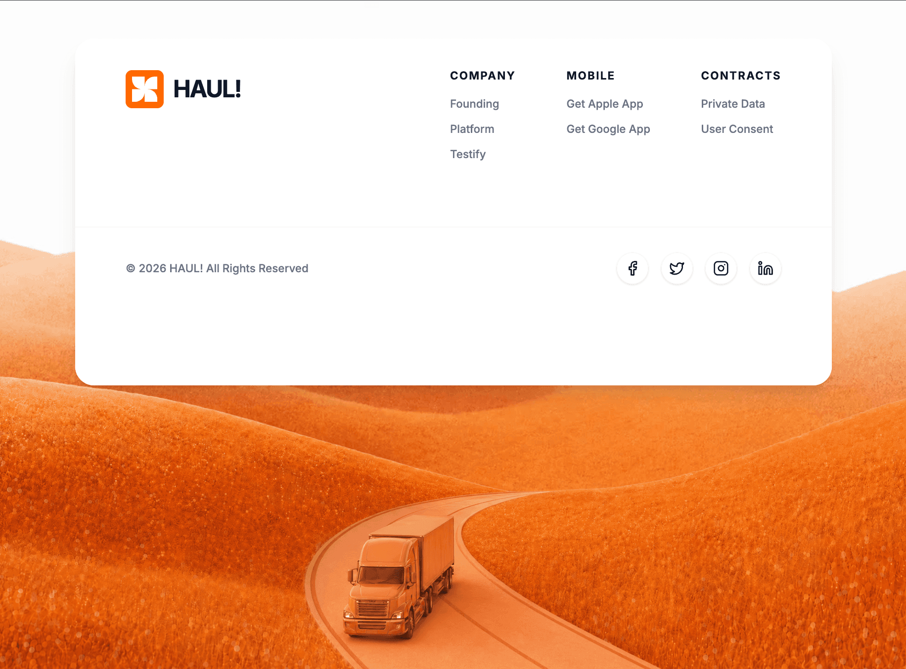
Build a React functional component using Tailwind CSS, `motion/react` for animations, and `lucide-react` for icons.

**1. Typography & Setup:**
- Import the "Inter" font from Google Fonts (weights 400, 500, 600, 700) and set it as the default sans-serif font in the Tailwind config/CSS.
- The overall background of the page should be `#f8f9fa`.

**2. Top Spacer Section (View Below):**
- Create a section at the top of the page. Height should be `50vh` (on mobile/lg) and `30vh` (on md screens).
- Background color: `#FDFDFD`.
- Center a text element that says "View Below". The text should be `text-gray-300`, small font, bold, uppercase, with wide `tracking-[0.5em]`.
- Animate this text with Framer Motion to fade in from `opacity: 0` to `opacity: 1`.

**3. Main Parallax Container:**
- Below the spacer, create a main full-viewport-height (`h-screen`) section.
- Set its background image to: `https://images.higgs.ai/?default=1&output=webp&url=https%3A%2F%2Fd8j0ntlcm91z4.cloudfront.net%2Fuser_38xzZboKViGWJOttwIXH07lWA1P%2Fhf_20260430_115327_3f256636-9e63-4885-8d0b-09317dc2b0a5.png&w=1280&q=85`
- Make sure the background covers the container (`bg-cover bg-center`) and set `overflow-hidden` with `relative` positioning.
- Set up a Framer Motion `useScroll` target on this container. Map the `scrollYProgress` from `[0, 1]` to `[-50, 150]` using `useTransform`. Apply this transformed y-value to the foreground truck image layer (described below).

**4. The Top-Aligned Footer Card:**
- Position a container `absolute top-0 w-full` inside the main parallax section. Give it top padding (`pt-12` mobile/lg, `pt-24` tablet).
- Inside, create a card constrained to `max-w-7xl mx-auto`.
- Card Styling: `bg-white/95`, `backdrop-blur-sm`, `shadow-xl`, rounded corners (`rounded-2xl` mobile, `rounded-3xl` desktop), `overflow-hidden`.
- Animation: The card should slide down and fade in (`initial={{ opacity: 0, y: -20 }}`, `animate={{ opacity: 1, y: 0 }}`, duration 0.8s easeOut).
- **Footer Content (Top Half):**
  - Use a flex row layout (flex-col on mobile, flex-row on md+) with spread space.
  - **Logo Area**: Include an orange square (`bg-orange-500`, 40x40px mobile, 48x48px desktop, rounded-lg, shadow-inner, p-2). Inside the square, place an SVG with viewBox "0 0 256 256" and this exact white path: `d="M 228 0 C 172.772 0 128 44.772 128 100 L 128 0 L 0 0 L 0 28 C 0 83.228 44.772 128 100 128 L 0 128 L 0 256 L 28 256 C 83.228 256 128 211.228 128 156 L 128 256 L 256 256 L 256 228 C 256 172.772 211.228 128 156 128 L 256 128 L 256 0 Z"`. Next to the logo block, add the text "HAUL!" (`text-gray-900`, 2xl/3xl, font-bold, tracking-tighter).
  - **Links Area**: Display 3 columns of links using flex. Layout: `Company` (Founding, Platform, Testify), `Mobile` (Get Apple App, Get Google App), `Contracts` (Private Data, User Consent). Section headers should be uppercase, tracking-widest, text-sm, bold. Link items should be gray-500, font-medium, and hover to `orange-600` with transition.
- **Footer Content (Bottom Bar):**
  - Add a top border (`border-gray-100`) and use a solid white background (`bg-white`).
  - Layout: flex, space between, aligning text to the left and social icons to the right.
  - Text: "© 2026 HAUL! All Rights Reserved" (text-sm, gray-500, medium).
  - **Social Icons**: Map through an array of icons imported from `lucide-react`: Facebook, Twitter, Instagram, Linkedin (w-5 h-5). Wrap them in `a` tags shaped as 40x40px circles with `border-gray-100`. On hover, they should turn `bg-orange-500` with white text and an `orange-500` border (transition all duration-300).

**5. Background Truck Parallax Layer:**
- Add a `motion.div` placed absolutely at the bottom of the container (`absolute inset-x-0 bottom-0 h-full`).
- Add standard pointer-events-none and z-20.
- Ensure the `y` axis style is tied to the `useTransform` created in step 3 so it scrolls at a different speed than the background.
- Inside, place an image with `src="https://roof-wish-40038865.figma.site/_components/v2/f31fd17907ce60745d45e83a61d44fd3810d5f25/truck_1.8c4bff83.png"`.
- Image styling: `w-full h-full object-contain object-bottom origin-bottom`. Add scale responsive classes (`scale-[1.5]` mobile, `scale-110` sm, `scale-[2.0]` md, `scale-105` lg) to ensure the truck fits properly on various screen widths.Models & stability
Recommended models
Independent reproductions
 Open reproduction ↗
GLM-5.3 单次生成;Codex 人工修复运行依赖、必要源码及移动布局,未重新生成。桌面/手机真实渲染和资源检查通过;完整功能与视觉还原尚未全部验收。源码、截图和修复记录见复现出处。
Reproduction source ↗Keep exploring

Portfolio landing page for 3D creator Jack, built with React, TypeScript and Framer Motion on a #0C0C0C dark background.
Prompt
Build a 3D Creator portfolio landing page for "Jack" using React, TypeScript, Tailwind CSS, Framer Motion, and Lucide React. The page has a dark theme (#0C0C0C background) with the font Kanit (Google Fonts, weights 300-900). The page title…

Single-file HTML recreation of the Vesper.ai one-screen landing page, using inline CSS and a small IIFE for the menu and animation fallback, with no framework and no dependencies. Useful for learning how to fit a whole page spec into one file.
Prompt
Recreate this exact single-viewport landing page for **Vesper.ai**. Document title: `Vesper.ai — Operational AI Infrastructure`. `lang="en"`. One HTML file with inline CSS and a small IIFE for the menu + animation fallback. Pure black `#00…

Hero for an AI workflow product, built with React 18 and Tailwind 3.4, with animation libraries explicitly ruled out and the icon list naming specific components.
Prompt
### Stack - **Vite** + **React 18** + **TypeScript** - **Tailwind CSS 3.4** - **lucide-react** for icons (`LogIn`, `UserPlus`, `Play`, `Sparkles`, `Menu`, `X`) - No Framer Motion -- all animations are CSS `transition-*` classes --- ### Fon…
Same creator
Each detail page keeps the original result, the prompt, and retest evidence in one reading path.


