加载中…
创作者 · viktoroddy
查看原始来源 ↗Prompt
提示词:

构建一个高级电动车落地页,具有深色电影感美学。整个网站使用黑色背景(hsl(0,0%,0%)),配浅色文字(主色 hsl(0,0%,95%))和橙色强调色(hsl(25,100%,50%))。不使用默认字体——保持极简和编辑感。使用 shadcn/ui 设计令牌。以下是按顺序排列的各版块:

设计系统(index.css)
--background: 0 0% 0%
--foreground: 0 0% 12%(用于 CTA 按钮内圆等深色元素)
--primary: 0 0% 95%(接近白色,用于所有文字)
--primary-foreground: 0 0% 12%
--accent-warm: 25 90% 55%(橙色强调色)
所有版块背景均为纯黑 hsl(0,0%,0%)

版块 1:导航栏
固定在顶部,全宽,圆角药丸形状
初始透明,滚动后:黑色背景加 backdrop-blur-xl,边框 primary/10
左侧 Logo:「Electric」加一个橙色圆点「.」——Logo 颜色随滚动从黑变白
导航链接:Services、About、Team、Contact —— 悬停时有放大的圆角背景药丸效果
右侧 CTA 按钮:「Get Started」,圆角药丸形状,内含一个圆形前景色背景中的 ArrowUpRight 图标
CTA 随滚动从黑色背景切换为白色背景
移动端:汉堡菜单,打开一个圆角深色遮罩层,内含链接和 CTA

版块 2:Hero
全视口高度,视频背景(/videos/hero_bg.mp4,自动播放、循环、静音)
左上方大标题:「Drive Beyond. / Unlock Pure Power」—— 白色文字,桌面端 78px
标题下方:「Learn more」链接,配箭头图标,带边框按钮(border-foreground),无填充

版块 3:Connected Systems(BigLinks)
上半部分:视频背景(/videos/biglinks_bg.mp4),带 60% 黑色叠加层
左对齐内容:药丸徽标「Connected Systems」,标题「Seamlessly Integrate / Every System」,副标题段落
12 列图标网格(移动端 4 列,平板 6 列,桌面端 12 列):每个图标 80x80px,圆角 rounded-xl,边框 white/10,背景 white/5,backdrop-blur。图标为橙色并带发光效果(drop-shadow-[0_0_8px_hsl(25,100%,50%)])。图标包括:Gauge、Zap、Shield、Cog、Fuel、Navigation、Bluetooth、Wifi、Radio、Car、Wrench、Settings(来自 lucide-react)
「Explore All」圆角药丸边框按钮
下半部分:3 个纵向堆叠的超大全宽文字链接:「Find a dealer」「Fleet & lease」「Book a test drive」—— 每个都是巨大字号(桌面端 110px),右对齐配一个 ChevronRight 图标,用 border-b border-primary/10 分隔,悬停时降低透明度

版块 4:Services
视频背景(/videos/services_card.mp4,自动播放、循环、静音)
居中内容:药丸徽标「Next-Gen Driving」,标题「Design, build and perfect / every single detail」
下方:一个玻璃拟态卡片(max-w-2xl,居中,bg-primary/5 backdrop-blur-xl border-primary/10 rounded-2xl)标题:「Effortless, All-Electric / Performance」
描述自适应技术的段落
3 个带橙色 Zap 图标(带发光)的要点:「Full-spectrum torque & drivetrain control」「Personalised driving & comfort profiles」「Track range & plan routes easily」

版块 5:About
黑色背景,左对齐
标签:一条线加「About Us」文字
标题:「Why You Absolutely Should / Experience Our Electric Range」(后半部分为 primary/50)
下方:两栏布局左侧:3 张抽象形状图片并排(shape-1.png、shape-2.png、shape-3.png),均为 object-contain,高 256px
右侧:两段正文文字,颜色 primary/70

版块 6:Audience(For Whom?)
黑色背景,左对齐
标签:一条线加「For Whom?」
标题:「Who Should Experience / Our Electric Range」(第二行为 primary/50)
4 列卡片网格:第一张卡片:圆形,带背景图片(audience-icon.png),aspect-square rounded-full border-primary/10
其余 3 张卡片:圆角 rounded-3xl 边框卡片,配 lucide 图标(Users、Gauge、Wrench),颜色 primary/50,下方配标签文字

底部:圆角信息条,配说明段落

版块 7:CTA
黑色外层背景,内层圆角 rounded-2xl 卡片,视频背景(/videos/services_card.mp4)加 50% 黑色叠加层
左对齐内容:标题「Experience the future / of driving today.」
副标题:「Book your test drive — one click, instant access. / No commitment, pure electric.」
圆角 CTA 按钮:「Book a Test Drive」,配一个圆形前景色徽标内的 ArrowUpRight 图标,药丸形状,背景 bg-primary

所需素材:
4 个视频:hero_bg.mp4、biglinks_bg.mp4、services_card.mp4(使用两次:Services 和 CTA)
3 张抽象形状 PNG:shape-1.png、shape-2.png、shape-3.png
1 张受众图标图片:audience-icon.png
所有图标使用 lucide-react

关键设计模式:
所有版块内边距:px-7 py-16 md:px-12 lg:px-20 lg:py-24,最大宽度 7xl 居中
标签模式:h-px w-6 bg-primary/40 线条加小号文字

徽标模式:圆角药丸,边框 primary/30,全大写字间距宽松
CTA 按钮模式:圆角,bg-primary text-primary-foreground,内含圆形图标徽标
橙色强调色仅用于:Logo 圆点、图标发光、特定高亮——始终为 hsl(25,100%,50%),可选叠加 drop-shadow 发光
适用模型与稳定度
建议模型
独立复测证据
2026年8月9日
继续探索

@Oluwaphilemon1 使用 Claude Fable 5 · Three.js · Blender · GSAP完成的网页案例,包含公开结果、完整 Prompt 与原始来源。
提示语
Claude Fable 5 和 GPT-5.6 很强🥵🥵🥵 下面是我如何使用 Claude 构建的 👇 提示词:「设计一个机构网站,把服务以 3D 超市商品包装的形式呈现」 使用 Three.js 和 WebGL 在浏览器中实时渲染所有产品 使用 Blender 制作包装模型,然后导出为 GLTF 以加载到 Three.js 中 使用 GSAP 实现流畅的产品旋转和悬停交互 如果你想做一个让客户感觉像是在购买高级商品的作品集,请保存这条 🛒
复制这段 TSX 组件源码,交给 Cursor、v0、Claude 等 AI 编程工具,说明这是「3D Animated Pin」的 Aceternity UI 组件实现,即可让它接入你的 React 项目,再按需替换文案、配色与触发参数复用。
提示语
// components/ui/3d-pin.tsx "use client"; import React, { useState } from "react"; import { motion } from "motion/react"; import { cn } from "@/lib/utils"; export const PinContainer = ({ children, title, href, className, containerClassName…
提示语
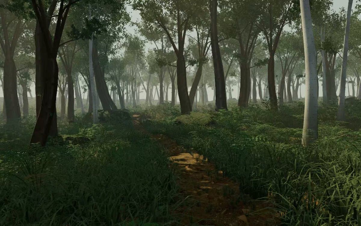
首先搜索 "/unlazy" skill,完整阅读它,并在整个任务中持续使用。 将此视为一项至少持续 {argument name="minimum duration" default="5 小时"} 的大型视觉构建。如果环境允许,最好进行 {argument name="optimal duration" default="8–24 小时"} 有实质意义的实现和迭代。不要在制作出一个还不错的场景后就停下。 在浏览器中创建一个细节极其丰富的实时 {argument nam