Build a full-viewport hero section for a SaaS landing page called "Questly" using React, TypeScript, Tailwind CSS 3, and Vite. Use `lucide-react` for all icons. No other UI libraries. --- FONT Use the font "Nimbus Sans TW01" loaded from this stylesheet in `index.html`: ``` https://db.onlinewebfonts.com/c/bb5de19d87c09a95216dc6ccd96e37c6?family=Nimbus+Sans+TW01 ``` Set the font stack in both `tailwind.config.js` and `index.css`: ``` 'Nimbus Sans TW01', 'Helvetica Neue', Helvetica, Arial, sans-serif ``` Enable `-webkit-font-smoothing: antialiased` and `-moz-osx-font-smoothing: grayscale` on `html`. --- BACKGROUND IMAGE The full hero section uses this image as a `background-image` (cover, centered): ``` https://images.higgs.ai/?default=1&output=webp&url=https%3A%2F%2Fd8j0ntlcm91z4.cloudfront.net%2Fuser_38xzZboKViGWJOttwIXH07lWA1P%2Fhf_20260611_133301_d5f2a94a-b22e-4e4a-a6b6-eacdddf1f5b0.pn…
查看原始来源 ↗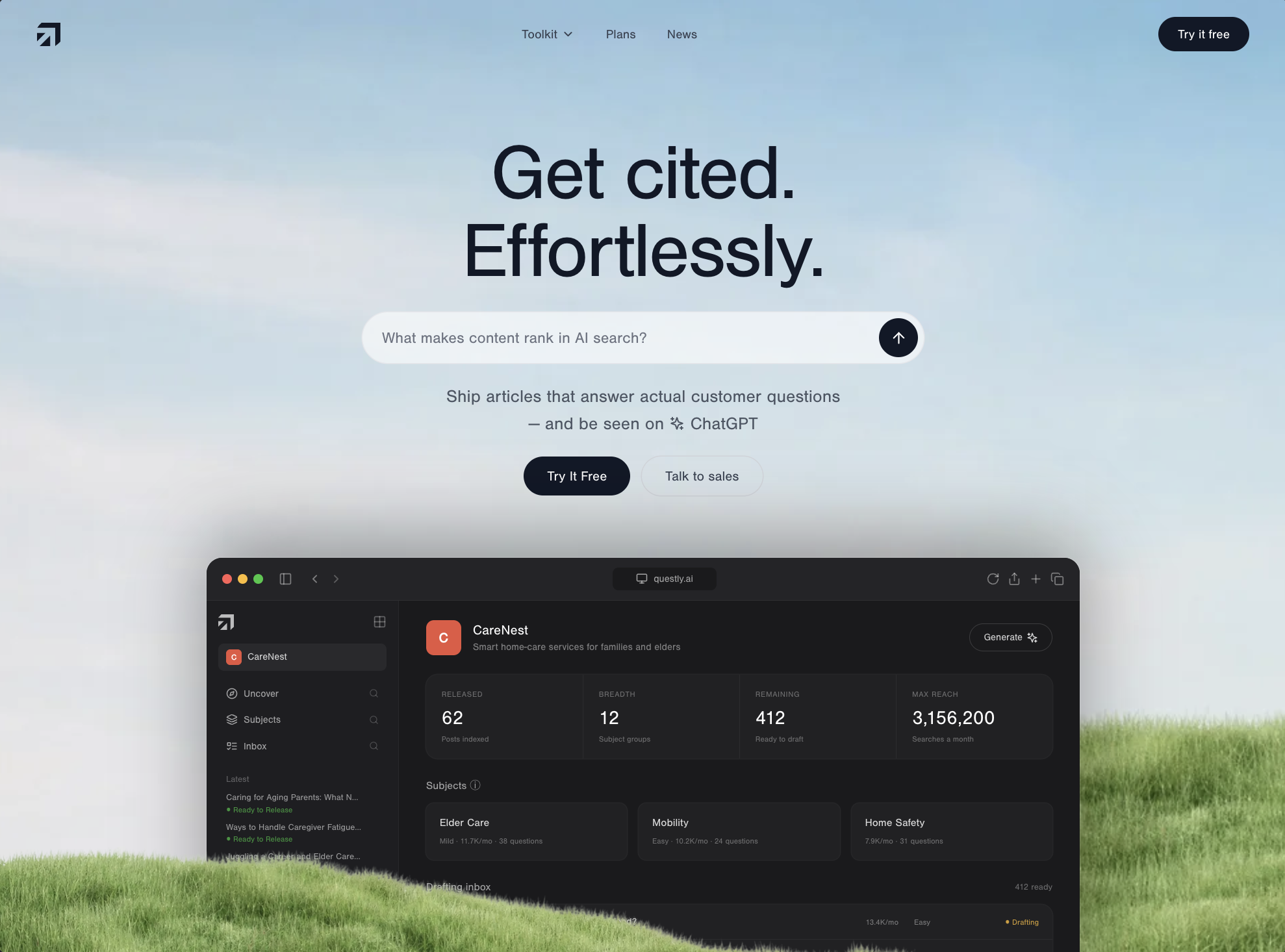
Prompt
Build a full-viewport hero section for a SaaS landing page called "Questly" using React, TypeScript, Tailwind CSS 3, and Vite. Use `lucide-react` for all icons. No other UI libraries.

---

FONT

Use the font "Nimbus Sans TW01" loaded from this stylesheet in `index.html`:

```
https://db.onlinewebfonts.com/c/bb5de19d87c09a95216dc6ccd96e37c6?family=Nimbus+Sans+TW01
```

Set the font stack in both `tailwind.config.js` and `index.css`:

```
'Nimbus Sans TW01', 'Helvetica Neue', Helvetica, Arial, sans-serif
```

Enable `-webkit-font-smoothing: antialiased` and `-moz-osx-font-smoothing: grayscale` on `html`.

---

BACKGROUND IMAGE

The full hero section uses this image as a `background-image` (cover, centered):

```
https://images.higgs.ai/?default=1&output=webp&url=https%3A%2F%2Fd8j0ntlcm91z4.cloudfront.net%2Fuser_38xzZboKViGWJOttwIXH07lWA1P%2Fhf_20260611_133301_d5f2a94a-b22e-4e4a-a6b6-eacdddf1f5b0.png&w=1280&q=85
```

Applied via inline `style={{ backgroundImage: url(...) }}` on the `

`. The section is `relative min-h-[100svh] overflow-hidden bg-cover bg-center flex flex-col`.

---

GRASS OVERLAY

An absolutely positioned grass PNG sits at the bottom of the section, full width, `z-10`, pointer-events-none, select-none:

```
https://res.cloudinary.com/dy5er7kv5/image/upload/q_auto/f_auto/v1781191264/grass_eam204.png
```

Classes: `pointer-events-none absolute bottom-0 left-0 z-10 w-full select-none`

---

LOGO (SVG Component)

A custom SVG logo component used in the navbar and dashboard sidebar. It uses `currentColor` for fill so it inherits text color. ViewBox: `0 0 256 256`. Path data:

```
M 144 256 L 27.598 256 L 144 139.598 Z M 256 207.5 L 200 256 L 200 56 L 0 56 L 48 0 L 256 0 Z M 0 204.402 L 0 112 L 92.402 112 Z
```

---

NAVBAR

- Positioned with `animate-fade-down relative z-20`
- Flex row: logo left, nav links center, CTA + hamburger right
- Horizontal padding: `px-5 sm:px-8 lg:px-10`, vertical: `py-4 sm:py-5`
- Logo: `text-gray-900`, icon sized `w-5 h-5 sm:w-6 sm:h-6`
- Desktop nav links (hidden below `md`): `text-[13px] text-gray-700`, hover `text-gray-900`, gap-8. Items: "Toolkit" (with `ChevronDown` icon `w-3.5 h-3.5`), "Plans", "News"
- CTA button: `bg-gray-900 text-white text-[13px] font-medium px-4 sm:px-5 py-2 rounded-full hover:bg-gray-800`
- Hamburger (md:hidden): `w-9 h-9 rounded-full text-gray-900 hover:bg-gray-900/10`, toggles `Menu`/`X` icons (`w-5 h-5`)
- Mobile dropdown (when open): `absolute left-4 right-4 top-full rounded-2xl bg-white/80 backdrop-blur-xl ring-1 ring-gray-200 px-5 py-3 animate-fade-up`. Links: `text-[15px] text-gray-700 hover:text-gray-900 border-b border-gray-200 last:border-b-0`

---

HERO CONTENT (centered, text-center)

Spacing between navbar and content uses a flex spacer: `flex-1 min-h-8 sm:min-h-12 lg:min-h-16 shrink-0`

Headline (h1)
- `text-gray-900 font-normal leading-[1.05] tracking-tight`
- Sizes: `text-[40px] min-[400px]:text-[44px] sm:text-6xl lg:text-7xl xl:text-[80px]`
- Two lines, each a `` with staggered `animate-fade-up`:
  - Line 1: "Get cited." (no delay)
  - Line 2: "Effortlessly." (`[animation-delay:100ms]`)

### Search Bar (form)
- `animate-fade-up [animation-delay:220ms] mt-5 sm:mt-6 w-full max-w-xl`
- Pill container: `flex items-center gap-3 rounded-full bg-white/60 backdrop-blur-md ring-1 ring-gray-200 pl-5 pr-1.5 py-1.5`
- Input: `flex-1 bg-transparent text-sm sm:text-base text-gray-900 placeholder-gray-500 outline-none py-2`, placeholder: "What makes content rank in AI search?"
- Submit button: `w-9 h-9 sm:w-10 sm:h-10 rounded-full bg-gray-900 text-white hover:scale-105 active:scale-95 transition-transform shrink-0`, contains `ArrowUp` icon `w-4 h-4 sm:w-[18px] sm:h-[18px]`

### Description
- `animate-fade-up [animation-delay:340ms] mt-4 sm:mt-5 text-gray-600 text-sm sm:text-base lg:text-lg leading-relaxed max-w-md`
- Text: "Ship articles that answer actual customer questions -- and be seen on [Sparkles icon] ChatGPT"
- Line break `
` before the dash
- `Sparkles` icon: `inline w-4 h-4 -mt-1`

### CTA Buttons
- `animate-fade-up [animation-delay:460ms] mt-4 sm:mt-5 flex flex-wrap items-center justify-center gap-3`
- **Primary**: `bg-gray-900 text-white text-sm font-medium px-6 py-2.5 rounded-full hover:bg-gray-800 hover:shadow-lg transition-all` -- "Try It Free"
- **Secondary**: `text-gray-700 text-sm font-medium px-6 py-2.5 rounded-full ring-1 ring-gray-300 hover:bg-gray-100 transition-colors` -- "Talk to sales"

---

## DASHBOARD MOCKUP (below the hero content)

Another flex spacer (`flex-1 min-h-10 sm:min-h-12 lg:min-h-16 shrink-0`) separates the content from the dashboard.

### Container
- `animate-hero-rise [animation-delay:620ms] relative z-0 w-[92%] sm:w-[84%] lg:w-[72%] max-w-4xl mx-auto shrink-0 -mb-10 sm:-mb-20 lg:-mb-32`
- Uses a **ScaledDashboard** wrapper: a `ResizeObserver`-based component that renders the mockup at a fixed design width of **896px** and scales it down via CSS `transform: scale()` to fit its container, with `transformOrigin: 'top left'`. The outer div's height is set to `inner.offsetHeight * scale` to prevent layout overflow.

### Mockup Chrome
- Outer: `rounded-t-2xl overflow-hidden bg-[#1a1a1c] shadow-[0_-20px_80px_rgba(0,0,0,0.35)] ring-1 ring-white/10 text-left`
- **Title bar**: `bg-[#242427] border-b border-white/5 px-4 py-2.5`
  - Traffic lights: three spans `w-2.5 h-2.5 rounded-full` colored `#ff5f57`, `#febc2e`, `#28c840`
  - Icons (all `w-3.5 h-3.5 text-white/40`): `PanelLeft`, `ChevronLeft`, `ChevronRight` (text-white/25)
  - Center URL bar: `bg-[#1a1a1c] rounded-md px-6 py-1 text-[10px] text-white/60` with `Monitor` icon -- text "questly.ai"
  - Right icons: `RotateCw`, `Share`, `Plus`, `Copy`

### Sidebar (22% width)
- `border-r border-white/5 bg-[#1e1e21] px-3 py-3.5`
- Logo icon `w-4 h-4 text-white/70` + `Grid` icon `w-3.5 h-3.5 text-white/30`
- Workspace badge: `w-4 h-4 rounded bg-[#e8553f]` with "C" letter, label "CareNest" `text-[10px] text-white/80`
- Nav items: Compass/Uncover, Layers/Subjects, ListTodo/Inbox -- `text-[10px] text-white/60`
- Recent articles list with "Ready to Release" green dots `text-[#28c840]/70`

### Main Content Area
- Header: workspace icon (larger `w-9 h-9 rounded-lg bg-[#e8553f]`), "CareNest" `text-sm font-medium text-white`, subtitle `text-[10px] text-white/45`, and a "Generate" button with `Sparkles` icon
- **Stats grid** (4 columns): `grid-cols-4 divide-x divide-white/5 rounded-xl bg-white/[0.03] ring-1 ring-white/5`
  - RELEASED: 62 / Posts indexed
  - BREADTH: 12 / Subject groups
  - REMAINING: 412 / Ready to draft
  - MAX REACH: 3,156,200 / Searches a month
  - Values: `text-xl font-medium text-white`, labels: `text-[8px] tracking-wider text-white/35`
- **Subject cards** (3 columns): Elder Care, Mobility, Home Safety -- `rounded-lg bg-white/[0.03] ring-1 ring-white/5`
- **Drafting inbox** table: 5 rows with question, volume, difficulty, status columns. "Drafting" status colored `text-[#febc2e]/80`

---

## ANIMATIONS (defined in index.css)

```css
@keyframes fade-up {
  from { opacity: 0; transform: translateY(24px); filter: blur(6px); }
  to { opacity: 1; transform: translateY(0); filter: blur(0); }
}

@keyframes fade-down {
  from { opacity: 0; transform: translateY(-16px); }
  to { opacity: 1; transform: translateY(0); }
}

@keyframes hero-rise {
  from { opacity: 0; transform: translateY(64px) scale(0.97); }
  to { opacity: 1; transform: translateY(0) scale(1); }
}

.animate-fade-up { animation: fade-up 0.9s cubic-bezier(0.22, 1, 0.36, 1) both; }
.animate-fade-down { animation: fade-down 0.7s cubic-bezier(0.22, 1, 0.36, 1) both; }
.animate-hero-rise { animation: hero-rise 1.1s cubic-bezier(0.22, 1, 0.36, 1) both; }
```

Staggered delays applied via inline `[animation-delay:Xms]` Tailwind arbitrary values. Respect `prefers-reduced-motion: reduce` by disabling all three animations.

---

RESPONSIVE BREAKPOINTS SUMMARY

| Element | Mobile (<640) | SM (640+) | MD (768+) | LG (1024+) | XL (1280+) |
|---|---|---|---|---|---|
| Headline | 40px / 44px@400 | 60px | -- | 70px | 80px |
| Nav links | Hidden (hamburger) | -- | Visible | -- | -- |
| Search bar width | full | -- | -- | -- | max-w-xl |
| Dashboard width | 92% | 84% | -- | 72% | -- |
| Dashboard bottom overlap | -mb-10 | -mb-20 | -- | -mb-32 | -- |

---

FILE STRUCTURE

```
src/
  App.tsx            -- renders <Hero />
  main.tsx           -- ReactDOM.createRoot
  index.css          -- Tailwind directives + custom keyframes
  components/
    Hero.tsx          -- main section with bg image, content, ScaledDashboard, grass overlay
    Navbar.tsx        -- top nav with mobile drawer
    Logo.tsx          -- SVG logo component
    DashboardMockup.tsx -- full browser-chrome dashboard mockup
```
复用方法
关键决定
观察最终结果里,页面信息层级、模块顺序和 CTA 是否一口气讲清楚 是否同时成立。
换到你的题材
把“目标结果 → 产品名称、目标用户、页面模块和主按钮 → 约束条件”抽成模板,后续可复用到同类任务。
容易翻车
围绕 模块顺序、价值主张写法与 CTA 位置 做单变量对照,并记录模型、成本和失败结果;重复成立后再沉淀为 Skill。
建议模型
Derived Skill
Skill 只从多个已发布 Case 的重复模式中派生,不是另一套投稿内容。
创作者
MotionSites 长期扎根MotionSites,交付可运行的界面,《Modern Agency》配了完整实现思路。
继续探索
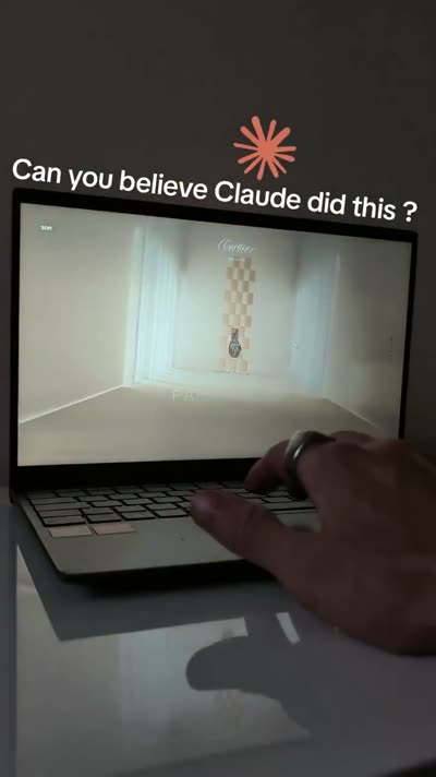
@Oluwaphilemon1 使用 Claude Fable 5 · Three.js · Blender · GSAP完成的网页案例,包含公开结果、完整 Prompt 与原始来源。
提示语
Claude Fable 5 和 GPT-5.6 很强🥵🥵🥵 下面是我如何使用 Claude 构建的 👇 提示词:「设计一个机构网站,把服务以 3D 超市商品包装的形式呈现」 使用 Three.js 和 WebGL 在浏览器中实时渲染所有产品 使用 Blender 制作包装模型,然后导出为 GLTF 以加载到 Three.js 中 使用 GSAP 实现流畅的产品旋转和悬停交互 如果你想做一个让客户感觉像是在购买高级商品的作品集,请保存这条 🛒
// components/ui/3d-pin.tsx "use client"; import React, { useState } from "react"; import { motion } from "motion/react"; import { cn } from "@/lib/utils"; export const PinContainer = ({ children, title, href, className, containerClassName, }: { children: React.ReactNode; title?: string; href?: string; className?: string; containerClassName?: string; }) => { const [transform, setTransform] = useState( "translate(-50%,-50%) rotateX(0deg)" ); const onMouseEnter = () => { setTransform("translate(-50%,-50%) rotateX(40deg) scale(0.8)"); }; const onMouseLeave = () => { setTransform("translate(-50%,-50%) rotateX(0deg) scale(1)"); }; return ( <a className={cn( "relative group/pin z-50 cursor-pointer", containerClassName )} onMouseEnter={onMouseEnter} onMouseLeave={onMouseLeave} href={href || "/"} > <div style={{ perspective: "1000px", transform: "rotateX(70deg) translateZ(0deg)", }} className="…
提示语
// components/ui/3d-pin.tsx "use client"; import React, { useState } from "react"; import { motion } from "motion/react"; import { cn } from "@/lib/utils"; export const PinContainer = ({ children, title, href, className, containerClassName…
.webp)
Build a single full-viewport hero section in React + TypeScript + Vite + Tailwind CSS, using `lucide-react` for icons. The component is a character-figurine carousel called "TOONHUB". **Fonts (load in `index.html` head):** ```html <link rel="preconnect" href="https://fonts.googleapis.com" /> <link rel="preconnect" href="https://fonts.gstatic.com" crossorigin /> <link href="https://fonts.googleapis.com/css2?family=Anton&family=Inter:wght@400;500;600;700&display=swap" rel="stylesheet" /> ``` Body font: `'Inter', sans-serif`. Display font (huge ghost text + bottom-right link): `'Anton', sans-serif`. **Image data (4 items, exact URLs and colors):** ```ts const IMAGES = [ { src: 'https://fifth-gentle-45902158.figma.site/_components/v2/4de492f6d9cf8244ad5293233e5c6f52407d42fc/1.02464a56.png', bg: '#F4845F', panel: '#F79B7F' }, { src: 'https://fifth-gentle-45902158.figma.site/_components/v2/4d…
提示语
Build a single full-viewport hero section in React + TypeScript + Vite + Tailwind CSS, using `lucide-react` for icons. The component is a character-figurine carousel called "TOONHUB". **Fonts (load in `index.html` head):** ```html <link re…
