

Loading…
Loading…
Creator · MotionSites
View original source ↗The reproduction prompt keeps the original and adds runtime, asset and acceptance requirements. These additions are not the author’s words.
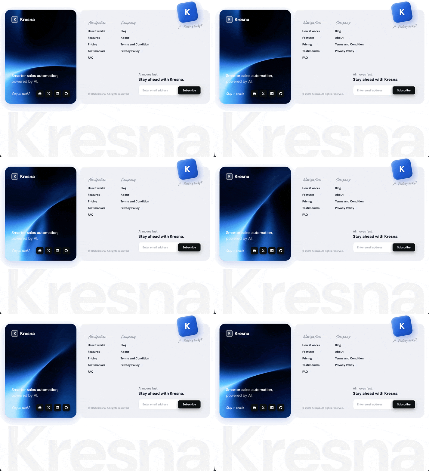
Build a single-file HTML footer component called Kresna — a sales-automation SaaS brand. The deliverable is one self-contained .html file with inline <style> and inline <script>. Render it inside a <section class="footer-section"> on a white page (body { background: #ffffff; padding: 48px 24px; }).
Fonts
Load from Google Fonts in the <head>:

DM Sans — weights 400, 500, 600, 700 (body, nav links, buttons, headings, watermark)
Caveat — weights 500, 600, 700 (handwritten accents: "Stay in touch!", "Feeling lucky?", column titles "Navigation"/"Company")

Default body font: 'DM Sans', sans-serif. Body color #2d3148.
Use *, *::before, *::after { box-sizing: border-box; margin: 0; padding: 0; }.
Layout structure
A .footer-wrapper with max-width: 1150px, centered, CSS grid grid-template-columns: 350px 1fr, gap: 16px, align-items: stretch. Two cards side by side:
Left card — .footer-left (video background)

Position relative, min-height: 340px, border-radius: 28px, padding: 32px, overflow: hidden
Box shadow: 0 12px 40px rgba(21, 76, 189, 0.25)
Fallback background: #1e4fc0
Flex column, justify-content: space-between
Contains, in order:

A <video class="footer-left-video" autoplay muted loop playsinline preload="auto"> with <source src="https://d8j0ntlcm91z4.cloudfront.net/user_38xzZboKViGWJOttwIXH07lWA1P/hf_20260503_104800_bc43ae09-f494-43e3-97d7-2f8c1692cfd7.mp4" type="video/mp4" />. Style: position: absolute; inset: 0; width: 100%; height: 100%; object-fit: cover; z-index: 0; pointer-events: none;. No overlays, no tints, no noise texture.
.footer-logo — flex row, gap: 10px, position: relative; z-index: 1. Contains:

.footer-logo-mark — a 32×32 rounded square (border-radius: 8px), background: rgba(255,255,255,0.15), border: 1.5px solid rgba(255,255,255,0.85), centered bold "K" letter inside (DM Sans, 16px, weight 700, white, letter-spacing: -0.02em)
<span class="footer-logo-name">Kresna</span> — DM Sans, 22px, weight 700, white, letter-spacing: -0.02em


.footer-tagline-container — margin-top: auto; margin-bottom: 28px, z-index: 1. Contains .footer-tagline (19px, weight 400, white, line-height: 1.45) with text:


     Smarter sales automation,<br>
     <span>powered by AI.</span>
 The inner `<span>` uses `color: rgba(255, 255, 255, 0.65)`.
4. .footer-social-row — flex row, justify-content: space-between, align-items: center, gap: 12px, z-index: 1. Contains:
- .footer-social-label — Caveat, 17px, weight 600, color rgba(255,255,255,0.9), letter-spacing: 0.3px, text: "Stay in touch!"
- .footer-social-icons — flex row, gap: 7px. Four .social-icon divs, each 36×36, border-radius: 9px, background: #0e1014, centered 15×15 white SVG, box shadow 0 6px 18px rgba(0,0,0,0.35), 0 2px 6px rgba(0,0,0,0.2). Hover: background: #000, transform: translateY(-2px), deeper shadow, transition: background 0.2s, transform 0.15s, box-shadow 0.2s. Icons in order: Discord, X (Twitter), LinkedIn, GitHub — use the official brand path d= strings for each in a <svg viewBox="0 0 24 24">.
Right card — .footer-right (light gray)

background: #f0f1f5, border-radius: 28px, padding: 40px, overflow: visible, box-shadow: 0 4px 20px rgba(0,0,0,0.04)
Flex column, justify-content: space-between, position relative
Contains:

Floating "Feeling lucky?" badge — .footer-lucky-graphic
Absolutely positioned, top: -36px; right: 40px, z-index: 10, flex column, align-items: flex-start, gap: 6px. Overflows above the top edge of the card.

.lucky-cube — 96×96, border-radius: 22px, transform: rotate(-10deg), gradient linear-gradient(135deg, #5b9ffb 0%, #1e5dd7 55%, #1448be 100%), layered shadows:

  inset 3px 3px 8px rgba(255,255,255,0.35),
  inset -3px -3px 12px rgba(0,0,0,0.18),
  8px 14px 28px rgba(20,72,200,0.35)
Inside, a <span class="lucky-cube-mark">K</span>: DM Sans, 42px, weight 700, white, letter-spacing: -0.04em, transform: rotate(10deg) (counter-rotates the cube), text-shadow: 0 3px 6px rgba(0,0,0,0.25), line-height: 1.

.lucky-text-row — flex row, gap: 6px, align-items: center, transform: rotate(-4deg), margin-top: 4px. Contains:

.lucky-arrow — 22×22 inline SVG, color: #9ca3af. SVG content: a curved hand-drawn arrow:


html    <svg viewBox="0 0 24 24" xmlns="http://www.w3.org/2000/svg">
      <path d="M3 20 C 6 14, 10 9, 18 5" />
      <path d="M18 5 L 12 5" />
      <path d="M18 5 L 18 11" />
    </svg>
SVG paths: `stroke: currentColor; fill: none; stroke-width: 2; stroke-linecap: round; stroke-linejoin: round`.

.lucky-text — Caveat, 20px, weight 600, color #9ca3af, white-space: nowrap, text: "Feeling lucky?"

Top — .footer-right-top with .footer-nav-cols
Flex row, gap: 72px, padding-top: 8px. Two .footer-col columns:

Column titles (.footer-col-title): Caveat, 24px, weight 600, italic, color #9ca3af, margin-bottom: 18px
Links (.footer-col a): block, DM Sans, 14px, weight 600, color #111827, margin-bottom: 14px, no underline, hover color #1f65d6, transition: color 0.2s

Column 1 — title "Navigation", links: How it works, Features, Pricing, Testimonials, FAQ
Column 2 — title "Company", links: Blog, About, Terms and Condition, Privacy Policy
Bottom — .footer-bottom
Flex row, align-items: flex-end, justify-content: space-between, margin-top: 48px. Contains:

.footer-copyright — DM Sans, 12.5px, weight 500, color #9ca3af, text: "© 2025 Kresna. All rights reserved."
.footer-cta-mini — flex column, gap: 14px, contains:

<h4> — 15px, weight 400, color #6b7280, line-height: 1.45, with text:


    AI moves fast.<br><strong>Stay ahead with Kresna.</strong>
The `<strong>` is block-level, 19px, weight 700, color `#111827`.

.footer-subscribe-row — flex row, width: 310px, background: #fff, border: 1px solid #e5e7eb, border-radius: 12px, padding: 5px, box-shadow: 0 2px 10px rgba(0,0,0,0.04). Contains:

<input type="email" placeholder="Enter email address"> — flex 1, padding: 11px 14px, transparent, no border, DM Sans 13.5px, color #111827, placeholder #9ca3af
<button type="button">Subscribe</button> — padding: 11px 22px, background: #111214, white text, DM Sans 13.5px weight 600, border-radius: 8px, shadow 0 6px 20px rgba(0,0,0,0.28), 0 2px 8px rgba(0,0,0,0.15). Hover: background: #000, deeper shadow, transform: translateY(-1px), transition: background 0.2s, box-shadow 0.2s, transform 0.15s.


Watermark — .footer-watermark (sits outside .footer-wrapper but inside the section)
A massive faded "Kresna" wordmark that scales fluidly to the full footer wrapper width with the visible glyph edges flush against the container edges.
CSS:
css.footer-watermark {
  max-width: 1150px;
  margin: -60px auto 0;
  pointer-events: none;
  user-select: none;
  position: relative;
  z-index: 0;
  line-height: 0;
}
.footer-watermark svg {
  display: block;
  width: 100%;
  height: auto;
  overflow: visible;
}
.footer-watermark text {
  font-family: 'DM Sans', sans-serif;
  font-weight: 700;
  letter-spacing: -0.03em;
  fill: rgba(0, 0, 0, 0.04);
}
HTML:
html<div class="footer-watermark" aria-hidden="true">
  <svg id="watermarkSvg" viewBox="62 95 876 175" preserveAspectRatio="xMidYMid meet" xmlns="http://www.w3.org/2000/svg">
    <text id="watermarkText" x="500" y="240" text-anchor="middle" font-size="320">Kresna</text>
  </svg>
</div>
Inline JS at the end of the section measures the rendered text bounding box with getBBox() and updates the SVG viewBox so the visible glyph edges sit flush against the container — runs after document.fonts.ready and on resize:
html<script>
  function fitWatermark() {
    const svg = document.getElementById('watermarkSvg');
    const text = document.getElementById('watermarkText');
    if (!svg || !text) return;
    try {
      const bbox = text.getBBox();
      svg.setAttribute('viewBox',
        `${bbox.x} ${bbox.y} ${bbox.width} ${bbox.height}`);
    } catch (e) {}
  }
  if (document.fonts && document.fonts.ready) {
    document.fonts.ready.then(fitWatermark);
  } else {
    window.addEventListener('load', fitWatermark);
  }
  window.addEventListener('resize', fitWatermark);
</script>
Responsive breakpoints
@media (max-width: 860px):

.footer-wrapper becomes grid-template-columns: 1fr
.footer-left min-height: auto, gap: 40px

@media (max-width: 560px):

.footer-right padding: 24px
.footer-nav-cols gap: 40px
.footer-bottom flex-direction: column, align-items: flex-start, gap: 24px
.footer-subscribe-row width: 100%
.footer-lucky-graphic right: 12px, top: -28px
.lucky-cube width: 72px, height: 72px
.lucky-cube-mark scaled proportionally if needed

Animations / transitions
No keyframe animations. All motion is hover-driven via CSS transition:

Social icons: background, transform, box-shadow on hover
Subscribe button: background, box-shadow, lift on hover
Nav links: color shift on hover

The video on the left card autoplays, loops, muted, plays inline (no controls).
Final markup order inside <section class="footer-section">
<section class="footer-section">
  <div class="footer-wrapper">
    <div class="footer-left"> [video, logo, tagline, social row] </div>
    <div class="footer-right"> [floating lucky badge, nav cols, bottom row] </div>
  </div>
  <div class="footer-watermark"> [SVG] </div>
  <script> [fitWatermark] </script>
</section>Models & stability
Recommended models
Independent retest evidence
Oct 19, 2026
Aug 31, 2026
Aug 31, 2026
Independent reproductions
 Open reproduction ↗
GLM-5.3 单次生成;Codex 人工修复运行依赖、必要源码及移动布局,未重新生成。桌面/手机真实渲染和资源检查通过;完整功能与视觉还原尚未全部验收。源码、截图和修复记录见复现出处。
Reproduction source ↗Keep exploring

Portfolio landing page for 3D creator Jack, built with React, TypeScript and Framer Motion on a #0C0C0C dark background.
Prompt
Build a 3D Creator portfolio landing page for "Jack" using React, TypeScript, Tailwind CSS, Framer Motion, and Lucide React. The page has a dark theme (#0C0C0C background) with the font Kanit (Google Fonts, weights 300-900). The page title…
A 404 page for the hosting provider NEXOVA, with a looping video background and navigation, giving an error page the polish of a landing page.
Prompt
Build a full-page 404 error page for a hosting company called "NEXOVA". The entire page is a single viewport-height layout with a looping background video, a navigation bar, a centered hero/404 section, and a multi-column footer. Use React…

Landing site for Drift, a schedule app friendly to people with ADHD, built with React, Vite, TypeScript and Tailwind. The calm, low-stimulation visual direction is itself the selling point.
Prompt
Build a single-page landing site for "Drift" -- a calm, ADHD-friendly planner app. Use React + Vite + TypeScript + Tailwind CSS + lucide-react for icons. No other UI libraries. ### Fonts Import via Google Fonts in `index.css`: - **Inter** …
Same creator
Each detail page keeps the original result, the prompt, and retest evidence in one reading path.


