Loading…
Creator · MotionSites
View original source ↗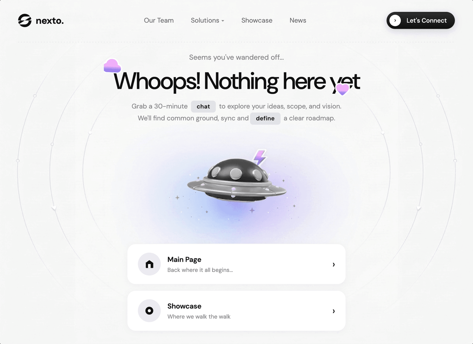
Prompt
Build a 404 "Page Not Found" hero page as a single full-viewport (100vh, no scroll) React + Vite + Tailwind CSS application using the DM Sans font and Google Material Symbols Rounded icons. The page must match the following specification exactly:

---

## Fonts & External Resources

- **Google Font:** DM Sans (all weights, variable: `opsz 9..40, wght 100..1000`)
- **Google Material Symbols Rounded:** `opsz,wght,FILL,GRAD@24,400,1,0`
- **Logo image:** `https://pub-f170a2592d2c4a1485466404c36807be.r2.dev/Tests/logoipsum-415.svg` (rendered with `filter: brightness(0)` to make it black, height 28px)
- **Background spaceship image:** `https://pub-e68758f43067417dba612b2371819aa1.r2.dev/viktor-components/alien-spaceship.png`

---

## Layout

The entire page is exactly `100vh` with `overflow: hidden` on html, body, and `#root`. No scrolling. The body uses `display: flex; flex-direction: column`. The `#root` div also uses `height: 100vh; display: flex; flex-direction: column; overflow: hidden`.

---

## Background

Body has a layered background:
1. The spaceship PNG centered at `center 40%`, sized with `background-size: contain`
2. A `linear-gradient(to top left, #F5F5F5, #F7F7F7)` covering the full page

Both are `background-attachment: fixed` and `no-repeat`.

---

## Color Variables (CSS custom properties)

```
--text-main: #1a1a1a
--text-secondary: #888888
--bg-page: #F5F5F5
--card-bg: #ffffff
```

---

## Navbar

- Max-width `1100px`, centered, padding `28px 40px`
- Has a dashed bottom border made with `background-image: linear-gradient(to right, rgba(0,0,0,0.08) 2px, transparent 2px); background-size: 6px 1px` on a `::after` pseudo-element
- **Left:** Logo (the SVG image + the text "nexto." in 20px bold, -0.3px letter-spacing, color #111, flex with 9px gap)
- **Center:** Nav links ("Our Team", "Solutions" with a dropdown arrow character, "Showcase", "News") - 14px, weight 400, opacity 0.65, hover to opacity 1, gap 36px
- **Right:** CTA button "Let's Connect" - dark gradient button (`linear-gradient(180deg, #2c2c2c 0%, #111111 100%)`), white text 13px weight 500, border-radius 40px, padding `5px 16px 5px 5px`. Has a white circular arrow icon (24px circle) on the LEFT side with a chevron SVG inside. Box-shadow `0 4px 15px rgba(0,0,0,0.15)`. On hover: translateY(-1px), stronger shadow, brightness(1.1).
- **Hamburger (mobile only):** 3 spans, 24px wide, 2px height, animates to X when active. Hidden on desktop, shown on mobile (`display: flex` at max-width 768px).

---

## Mobile Navigation

- Fixed full-screen overlay, slides in from right with `transform: translateX(100%)` -> `translateX(0)`, cubic-bezier(0.77, 0, 0.175, 1) transition
- On mobile: left-aligned, large links (38px, weight 800, letter-spacing -1.5px), each with bottom border, padding 24px 0
- Last link is the CTA button styled same as navbar but with 32px arrow circle

---

## Main Content Area

- `flex: 1`, centered both ways (`align-items: center; justify-content: center`), max-width 700px, padding `20px 20px 30px`
- **Lost text:** "Seems you've wandered off..." - 15px, color `--text-secondary`, weight 400, margin-bottom 12px
- **Title wrapper:** `position: relative; display: inline-block; margin-bottom: 14px`
  - **Cloud decoration:** Material Symbols "cloud" icon, positioned `top: -18px; left: -24px`, font-size 42px, with gradient text fill (`linear-gradient(to bottom, #F7B2FB 50%, #786EF1 80%, #5588FB 100%)` using `-webkit-background-clip: text; -webkit-text-fill-color: transparent`), white drop-shadow outline, `floatSlow` animation (5s, 0.3s delay)
  - **Heart decoration:** Material Symbols "favorite" icon, positioned `bottom: -15px; right: 20px`, font-size 32px, same gradient fill, white drop-shadow outline, `floatSlow` animation (4.5s, 1s delay)
  - **Title:** "Whoops! Nothing here yet" - `font-size: clamp(34px, 5vw, 52px)`, weight 500, letter-spacing -1.5px, line-height 1.08, color #0f0f0f
- **Subtext:** "Grab a 30-minute `chat` to explore your ideas, scope, and vision. We'll find common ground, sync and `define` a clear roadmap." - 14px, color `--text-secondary`, line-height 1.7, max-width 470px, margin-bottom 28px. The words "chat" and "define" are in highlighted tags (inline-flex, background #E0E2E7, 12.5px, weight 600, padding 2px 12px, border-radius 6px)

---

## Navigation Cards

- Flex column, gap 12px, max-width 460px, positioned at bottom with `margin-top: auto`
- **Card 1 "Main Page":** House SVG icon (path: `M3 9.5L12 3l9 6.5V20a1 1 0 01-1 1H5a1 1 0 01-1-1V9.5z` with door `M9 21V12h6v9` in white). Subtitle: "Back where it all begins..."
- **Card 2 "Showcase":** Circle-dot SVG icon (circle r=9 filled, inner circle r=3.5 white). Subtitle: "Where we walk the walk"
- Each card: white background, border-radius 18px, padding 18px 22px, flex between, 1px border rgba(0,0,0,0.05), shadow `0 2px 12px rgba(0,0,0,0.04)`. On hover: translateY(-3px), shadow `0 8px 28px rgba(0,0,0,0.08)`.
- Icon container: 48px circle, background #eaecf0, scales 1.05 on card hover
- Right chevron arrow (rsaquo character, 21px), translateX(6px) on hover
- Card title: 15px weight 600, subtitle: 12px color `--text-secondary`

---

## Animations

```css
@keyframes floatSlow {
  0%, 100% { transform: translateY(0px) rotate(0deg); }
  50% { transform: translateY(-10px) rotate(3deg); }
}
```

---

## Responsive Breakpoints

**768px and below:**
- Hide nav-links and desktop CTA button, show hamburger
- Background-size: 90%, position: center 45%
- Navbar padding: 20px
- Title: 30px, decorations smaller
- Cards: full width, gap 10px, smaller padding/icons

**480px and below:**
- Title: 26px
- Background-size: 100%
- Decorations even smaller

---Models & stability
Recommended models
Keep exploring

A webpage case by @Oluwaphilemon1 using Claude Fable 5 · Three.js · Blender · GSAP, including the public result, full prompt, and original source.
Prompt
Claude Fable 5 and GPT-5.6 are powerful🥵🥵🥵 Here Is How I built with Claude 👇 Prompt: "Design an agency site where services are presented as supermarket product packaging in 3D" Use Three.js with WebGL to render al
复制这段 TSX 组件源码,交给 Cursor、v0、Claude 等 AI 编程工具,说明这是「3D Animated Pin」的 Aceternity UI 组件实现,即可让它接入你的 React 项目,再按需替换文案、配色与触发参数复用。
Prompt
// components/ui/3d-pin.tsx "use client"; import React, { useState } from "react"; import { motion } from "motion/react"; import { cn } from "@/lib/utils"; export const PinContainer = ({ children, title, href, className, containerClassName…

一个复杂的提示词,用于利用 Three.js 风格优化和逼真光照,在浏览器中生成精细的实时 3D 森林环境。
Prompt
First search for the "/unlazy" skill, read it fully, and use it throughout the entire task. Treat this as a major visual build lasting at least {argument name="minimum duration" d

