加载中…
创作者 · MotionSites
查看原始来源 ↗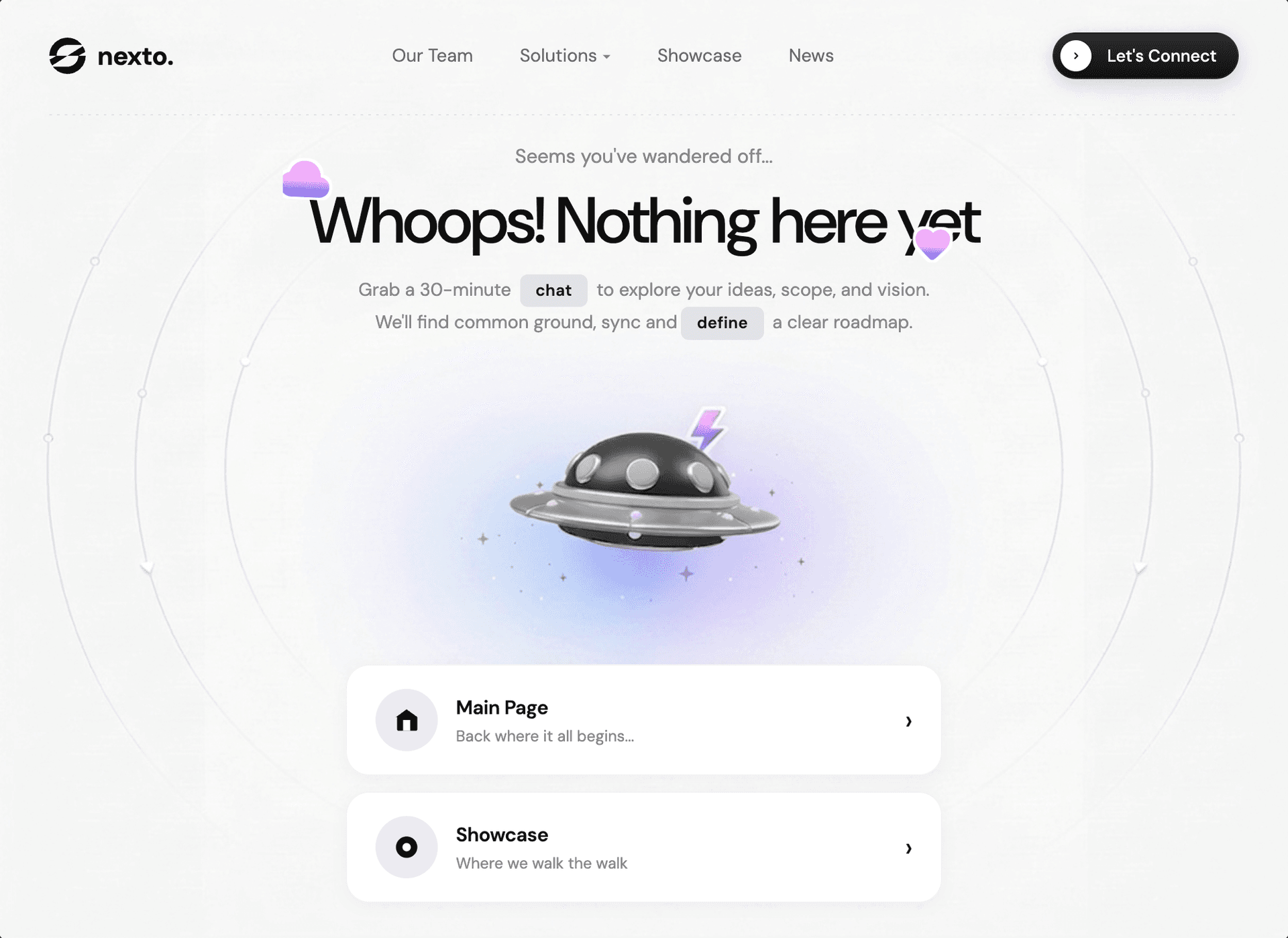
Prompt
构建一个 404“找不到页面”hero page,作为单一全 viewport(100vh、不可滚动)的 React + Vite + Tailwind CSS 应用,使用 DM Sans font 和 Google Material Symbols Rounded icons。页面必须严格匹配以下规格:

---

## 字体与外部资源

- **Google Font:** DM Sans(所有字重,variable:`opsz 9..40, wght 100..1000`)
- **Google Material Symbols Rounded:** `opsz,wght,FILL,GRAD@24,400,1,0`
- **Logo 图片:** `https://pub-f170a2592d2c4a1485466404c36807be.r2.dev/Tests/logoipsum-415.svg`(使用 `filter: brightness(0)` 渲染为黑色,高度 28px)
- **背景宇宙飞船图片:** `https://pub-e68758f43067417dba612b2371819aa1.r2.dev/viktor-components/alien-spaceship.png`

---

## 布局

整个页面恰好为 `100vh`,html、body 和 `#root` 均设置 `overflow: hidden`。不可滚动。body 使用 `display: flex; flex-direction: column`。`#root` div 同样使用 `height: 100vh; display: flex; flex-direction: column; overflow: hidden`。

---

## 背景

Body 使用分层背景:
1. 宇宙飞船 PNG 居中于 `center 40%`,使用 `background-size: contain` 调整尺寸
2. 覆盖整个页面的 `linear-gradient(to top left, #F5F5F5, #F7F7F7)`

两者均使用 `background-attachment: fixed` 和 `no-repeat`。

---

## 颜色变量(CSS custom properties)

```
--text-main: #1a1a1a
--text-secondary: #888888
--bg-page: #F5F5F5
--card-bg: #ffffff
```

---

## Navbar

- Max-width `1100px`,居中,padding `28px 40px`
- 底部带虚线 border,通过 `::after` pseudo-element 上的 `background-image: linear-gradient(to right, rgba(0,0,0,0.08) 2px, transparent 2px); background-size: 6px 1px` 制作
- **左侧:** Logo(SVG 图片 + 文字“nexto.”,20px bold、-0.3px letter-spacing、颜色 #111,flex 布局且 gap 为 9px)
- **中间:** 导航链接(“我们的团队”“解决方案”并带 dropdown arrow character、“案例展示”“新闻”)——14px、weight 400、opacity 0.65,hover 时变为 opacity 1,gap 36px
- **右侧:** CTA 按钮“联系我们”——深色 gradient button(`linear-gradient(180deg, #2c2c2c 0%, #111111 100%)`),白色文字,13px、weight 500、border-radius 40px、padding `5px 16px 5px 5px`。左侧有一个白色圆形 arrow icon(24px 圆形),内部带 chevron SVG。Box-shadow `0 4px 15px rgba(0,0,0,0.15)`。hover 时:translateY(-1px)、更强的 shadow、brightness(1.1)。
- **Hamburger(仅移动端):** 3 个 spans,宽 24px、高 2px,active 时动画变为 X。desktop 隐藏,mobile 显示(max-width 768px 时为 `display: flex`)。

---

## 移动端导航

- 固定全屏 overlay,以 `transform: translateX(100%)` -> `translateX(0)` 从右侧滑入,使用 cubic-bezier(0.77, 0, 0.175, 1) transition
- 在 mobile 上:左对齐,大号链接(38px、weight 800、letter-spacing -1.5px),每个链接带 bottom border,padding 24px 0
- 最后一个链接为 CTA 按钮,样式与 navbar 相同,但 arrow circle 为 32px

---

## 主内容区域

- `flex: 1`,水平和垂直居中(`align-items: center; justify-content: center`),max-width 700px,padding `20px 20px 30px`
- **迷路文字:**“看来你迷路了……”——15px,颜色 `--text-secondary`,weight 400,margin-bottom 12px
- **标题 wrapper:** `position: relative; display: inline-block; margin-bottom: 14px`
  - **云朵装饰:** Material Symbols“cloud”icon,定位为 `top: -18px; left: -24px`,font-size 42px,使用 gradient text fill(通过 `-webkit-background-clip: text; -webkit-text-fill-color: transparent` 实现 `linear-gradient(to bottom, #F7B2FB 50%, #786EF1 80%, #5588FB 100%)`)、白色 drop-shadow outline,以及 `floatSlow` animation(5s、0.3s delay)
  - **爱心装饰:** Material Symbols“favorite”icon,定位为 `bottom: -15px; right: 20px`,font-size 32px,使用相同的 gradient fill、白色 drop-shadow outline,以及 `floatSlow` animation(4.5s、1s delay)
  - **标题:**“糟糕!这里还什么都没有”——`font-size: clamp(34px, 5vw, 52px)`、weight 500、letter-spacing -1.5px、line-height 1.08、颜色 #0f0f0f
- **副文案:**“预约一次 30 分钟的 `交流`,探讨你的想法、范围和愿景。我们会找到共识、保持同步,并 `制定` 清晰的路线图。”——14px、颜色 `--text-secondary`、line-height 1.7、max-width 470px、margin-bottom 28px。“交流”和“制定”这两个词使用高亮 tags(inline-flex、background #E0E2E7、12.5px、weight 600、padding 2px 12px、border-radius 6px)

---

## 导航卡片

- Flex column,gap 12px,max-width 460px,通过 `margin-top: auto` 定位在底部
- **卡片 1“主页”:** House SVG icon(白色 path:`M3 9.5L12 3l9 6.5V20a1 1 0 01-1 1H5a1 1 0 01-1-1V9.5z`,以及 door `M9 21V12h6v9`)。副标题:“回到一切开始的地方……”
- **卡片 2“案例展示”:** Circle-dot SVG icon(circle r=9 填充,inner circle r=3.5 白色)。副标题:“用行动证明实力的地方”
- 每张卡片:白色 background、border-radius 18px、padding 18px 22px、flex between、1px border rgba(0,0,0,0.05)、shadow `0 2px 12px rgba(0,0,0,0.04)`。hover 时:translateY(-3px)、shadow `0 8px 28px rgba(0,0,0,0.08)`。
- Icon container:48px 圆形,background #eaecf0,在 card hover 时缩放至 1.05
- 右侧 chevron arrow(rsaquo character,21px),hover 时 translateX(6px)
- 卡片标题:15px、weight 600;副标题:12px、颜色 `--text-secondary`

---

## 动画

```css
@keyframes floatSlow {
  0%, 100% { transform: translateY(0px) rotate(0deg); }
  50% { transform: translateY(-10px) rotate(3deg); }
}
```

---

## 响应式断点

**768px 及以下:**
- 隐藏 nav-links 和 desktop CTA 按钮,显示 hamburger
- Background-size:90%,position:center 45%
- Navbar padding:20px
- 标题:30px,decorations 更小
- 卡片:全宽、gap 10px、padding/icons 更小

**480px 及以下:**
- 标题:26px
- Background-size:100%
- Decorations 进一步缩小

---适用模型与稳定度
建议模型
继续探索

@Oluwaphilemon1 使用 Claude Fable 5 · Three.js · Blender · GSAP完成的网页案例,包含公开结果、完整 Prompt 与原始来源。
提示语
Claude Fable 5 和 GPT-5.6 很强🥵🥵🥵 下面是我如何使用 Claude 构建的 👇 提示词:「设计一个机构网站,把服务以 3D 超市商品包装的形式呈现」 使用 Three.js 和 WebGL 在浏览器中实时渲染所有产品 使用 Blender 制作包装模型,然后导出为 GLTF 以加载到 Three.js 中 使用 GSAP 实现流畅的产品旋转和悬停交互 如果你想做一个让客户感觉像是在购买高级商品的作品集,请保存这条 🛒
复制这段 TSX 组件源码,交给 Cursor、v0、Claude 等 AI 编程工具,说明这是「3D Animated Pin」的 Aceternity UI 组件实现,即可让它接入你的 React 项目,再按需替换文案、配色与触发参数复用。
提示语
// components/ui/3d-pin.tsx "use client"; import React, { useState } from "react"; import { motion } from "motion/react"; import { cn } from "@/lib/utils"; export const PinContainer = ({ children, title, href, className, containerClassName…

提示语
首先搜索 "/unlazy" skill,完整阅读它,并在整个任务中持续使用。 将此视为一项至少持续 {argument name="minimum duration" default="5 小时"} 的大型视觉构建。如果环境允许,最好进行 {argument name="optimal duration" default="8–24 小时"} 有实质意义的实现和迭代。不要在制作出一个还不错的场景后就停下。 在浏览器中创建一个细节极其丰富的实时 {argument nam

