Build a "Core Features" marketing section as a single centered component with three gradient cards. Use the Inter font family (weights 400, 500, 600) loaded from Google Fonts: `https://fonts.googleapis.com/css2?family=Inter:wght@400;500;600&display=swap`. **Page shell:** - Body: white background `#ffffff`, 80px top/bottom + 20px left/right padding, flex centered, Inter font. - Global reset: `* { box-sizing: border-box; margin: 0; padding: 0; }`. **Container (`.c1-container`):** max-width 1100px, full width, text-align center. **Header block:** - Badge (`.c1-badge`): text "Core Features", 0.75rem, weight 600, uppercase, letter-spacing 1px, gradient text using `linear-gradient(90deg, #F5C344, #F28482, #B567C2)` with `-webkit-background-clip: text` and transparent fill. 16px bottom margin. - Title (`.c1-title`): "Built for Speed & Quality", font-size 2.75rem, weight 500, color `#0f172a`, l…
查看原始来源 ↗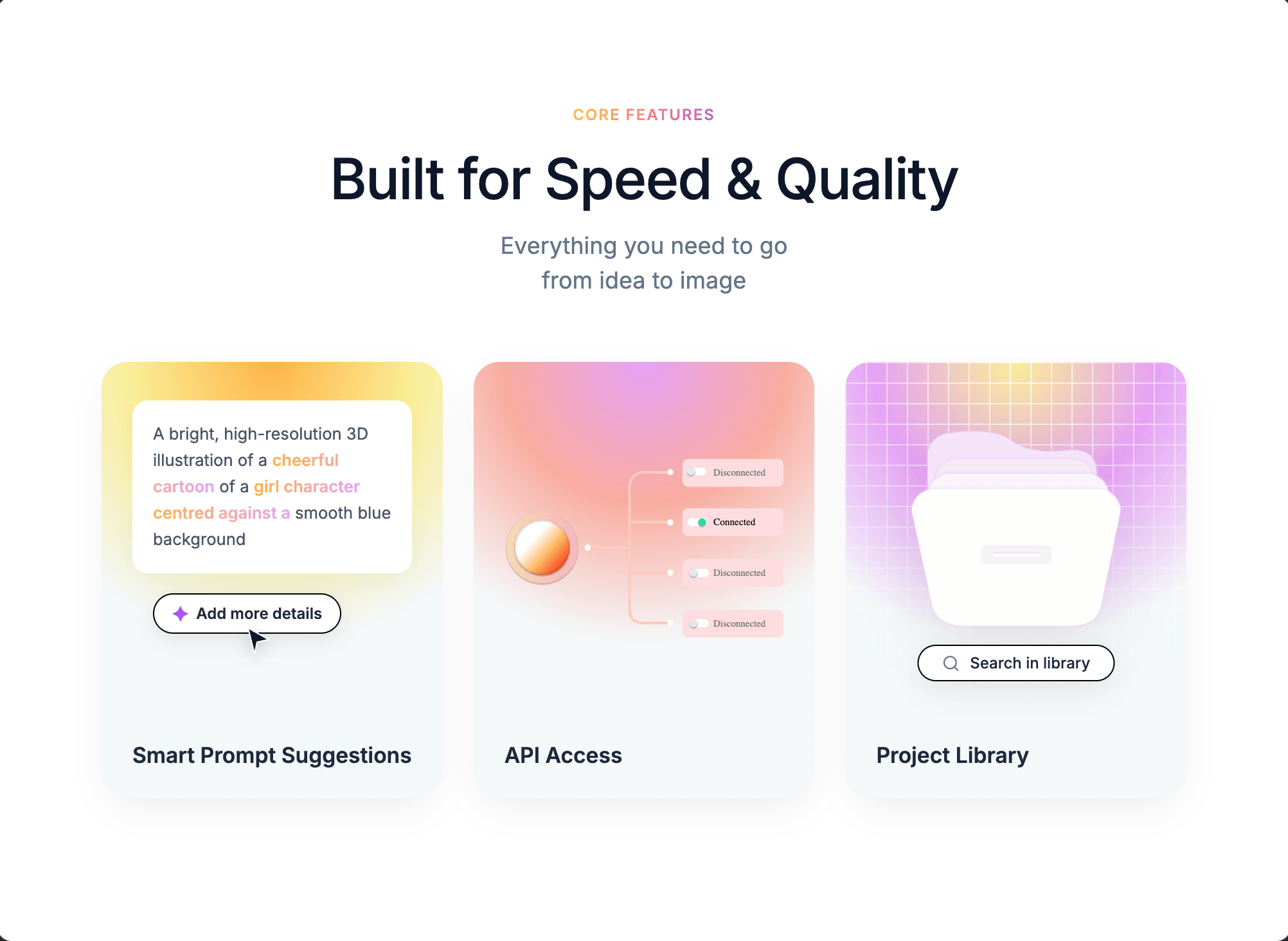
Prompt
Build a "Core Features" marketing section as a single centered component with three gradient cards. Use the Inter font family (weights 400, 500, 600) loaded from Google Fonts: `https://fonts.googleapis.com/css2?family=Inter:wght@400;500;600&display=swap`.

**Page shell:**
- Body: white background `#ffffff`, 80px top/bottom + 20px left/right padding, flex centered, Inter font.
- Global reset: `* { box-sizing: border-box; margin: 0; padding: 0; }`.

**Container (`.c1-container`):** max-width 1100px, full width, text-align center.

**Header block:**
- Badge (`.c1-badge`): text "Core Features", 0.75rem, weight 600, uppercase, letter-spacing 1px, gradient text using `linear-gradient(90deg, #F5C344, #F28482, #B567C2)` with `-webkit-background-clip: text` and transparent fill. 16px bottom margin.
- Title (`.c1-title`): "Built for Speed & Quality", font-size 2.75rem, weight 500, color `#0f172a`, letter-spacing -0.02em, 12px bottom margin.
- Subtitle (`.c1-subtitle`): "Everything you need to go" + `<br>` + "from idea to image", 1.125rem, color `#64748b`, line-height 1.5, 50px bottom margin.

**Grid (`.c1-grid`):** 3 equal columns, 24px gap. Breakpoints: 2 columns under 900px, 1 column under 600px (title scales to 2.25rem).

**Card base (`.c1-card`):** 20px border-radius, height 340px, flex column justify-end, relative, overflow hidden, text-align left, background `#F4F8F9`, shadow `0 10px 30px -10px rgba(0,0,0,0.1)`. Titles inside (`h3`): 1.05rem, weight 600, color `#1e293b`, padding 24px, z-index 2.

**Card 1 — Smart Prompt Suggestions (`.c1-card-1`):**
- Background: `radial-gradient(circle at 50% 0%, #FFB347 0%, #F9ED96 30%, #F4F8F9 60%, #F4F8F9 100%)`.
- Prompt box (white, 12px radius, 16px padding, 0.8rem text, color `#475569`, line-height 1.6, shadow `0 8px 20px rgba(0,0,0,0.04)`), absolutely positioned top:30px/left:24px/right:24px. Text: "A bright, high-resolution 3D illustration of a **cheerful cartoon** of a **girl character** **centred against a** smooth blue background" — bold phrases have class `.c1-blur-text` with gradient `linear-gradient(90deg, #FFB347, #E5A1F5)` as clipped text, weight 600.
- "Add more details" pill button: absolute top:180px/left:40px, white background, 1px solid black border, 5px 14px padding, 20px radius, 0.75rem text, weight 600, color `#1e293b`, shadow `0 4px 15px rgba(0,0,0,0.08)`, includes `✦` character styled `color: #a855f7; font-size: 1rem` with 6px gap.
- Cursor SVG arrow: absolute top:205px/left:110px, 24x24, fill `#0f172a`, white stroke 1px, drop-shadow `0 4px 6px rgba(0,0,0,0.2)`, z-index 10. Path: `M4 2L20 11L11 13L9 22L4 2Z`.
- Heading: "Smart Prompt Suggestions".

**Card 2 — API Access (`.c1-card-2`):**
- Background: `radial-gradient(circle at 50% 0%, #E5A1F5 0%, #F8ACA0 30%, #F4F8F9 60%, #F4F8F9 100%)`.
- `.c1-api-visual` absolutely positioned top:0/left:0/right:0/bottom:70px, flex centered, 24px horizontal padding.
- Image (`.c1-network-img`): width 100%, height 180px, object-fit contain, margin-top 20px. Source: `https://pub-f170a2592d2c4a1485466404c36807be.r2.dev/viktor/network.svg`.
- Heading: "API Access".

**Card 3 — Project Library (`.c1-card-3`):**
- Background: `radial-gradient(circle at 50% 0%, #F9ED96 0%, #E5A1F5 30%, #F4F8F9 60%, #F4F8F9 100%)`.
- Mesh overlay (`.c1-mesh`): absolute inset 0, background image = two linear gradients of `rgba(255,255,255,0.8) 1px, transparent 1px` (horizontal and 90deg vertical), background-size 16px 16px, masked with `radial-gradient(circle at center top, black 0%, transparent 80%)` (include `-webkit-mask-image`).
- Folder image (`.c1-folder`): absolute top:50px, horizontally centered via `left:50%; transform:translateX(-50%)`, width 170px, drop-shadow `0 15px 25px rgba(0,0,0,0.08)`. Source: `https://pub-f170a2592d2c4a1485466404c36807be.r2.dev/viktor/library%20icon.svg`.
- Search pill (`.c1-search`): absolute top:220px, centered, white background, 1px solid black, 6px 18px padding, 20px radius, 0.75rem text weight 500 color `#1e293b`, shadow `0 8px 20px rgba(0,0,0,0.06)`, white-space nowrap, 8px gap. Contains a 14x14 lucide-style search SVG (circle cx=11 cy=11 r=8, line 21,21→16.65,16.65, stroke `#64748b`, stroke-width 2, round caps/joins) followed by text "Search in library".
- Heading: "Project Library".

**Note:** No animations are defined in this component — it is purely static styling. No JavaScript behavior, no hover effects. Use Supabase if any data persistence is needed, though this section requires none.
复用方法
关键决定
观察最终结果里,页面信息层级、模块顺序和 CTA 是否一口气讲清楚 是否同时成立。
换到你的题材
把“目标结果 → 产品名称、目标用户、页面模块和主按钮 → 约束条件”抽成模板,后续可复用到同类任务。
容易翻车
围绕 模块顺序、价值主张写法与 CTA 位置 做单变量对照,并记录模型、成本和失败结果;重复成立后再沉淀为 Skill。
建议模型
Derived Skill
Skill 只从多个已发布 Case 的重复模式中派生,不是另一套投稿内容。
创作者
MotionSites 长期扎根MotionSites,交付可运行的界面,《Modern Agency》配了完整实现思路。
继续探索
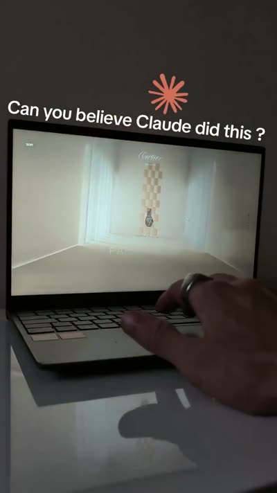
@Oluwaphilemon1 使用 Claude Fable 5 · Three.js · Blender · GSAP完成的网页案例,包含公开结果、完整 Prompt 与原始来源。
提示语
Claude Fable 5 和 GPT-5.6 很强🥵🥵🥵 下面是我如何使用 Claude 构建的 👇 提示词:「设计一个机构网站,把服务以 3D 超市商品包装的形式呈现」 使用 Three.js 和 WebGL 在浏览器中实时渲染所有产品 使用 Blender 制作包装模型,然后导出为 GLTF 以加载到 Three.js 中 使用 GSAP 实现流畅的产品旋转和悬停交互 如果你想做一个让客户感觉像是在购买高级商品的作品集,请保存这条 🛒
// components/ui/3d-pin.tsx "use client"; import React, { useState } from "react"; import { motion } from "motion/react"; import { cn } from "@/lib/utils"; export const PinContainer = ({ children, title, href, className, containerClassName, }: { children: React.ReactNode; title?: string; href?: string; className?: string; containerClassName?: string; }) => { const [transform, setTransform] = useState( "translate(-50%,-50%) rotateX(0deg)" ); const onMouseEnter = () => { setTransform("translate(-50%,-50%) rotateX(40deg) scale(0.8)"); }; const onMouseLeave = () => { setTransform("translate(-50%,-50%) rotateX(0deg) scale(1)"); }; return ( <a className={cn( "relative group/pin z-50 cursor-pointer", containerClassName )} onMouseEnter={onMouseEnter} onMouseLeave={onMouseLeave} href={href || "/"} > <div style={{ perspective: "1000px", transform: "rotateX(70deg) translateZ(0deg)", }} className="…
提示语
// components/ui/3d-pin.tsx "use client"; import React, { useState } from "react"; import { motion } from "motion/react"; import { cn } from "@/lib/utils"; export const PinContainer = ({ children, title, href, className, containerClassName…
.webp)
Build a single full-viewport hero section in React + TypeScript + Vite + Tailwind CSS, using `lucide-react` for icons. The component is a character-figurine carousel called "TOONHUB". **Fonts (load in `index.html` head):** ```html <link rel="preconnect" href="https://fonts.googleapis.com" /> <link rel="preconnect" href="https://fonts.gstatic.com" crossorigin /> <link href="https://fonts.googleapis.com/css2?family=Anton&family=Inter:wght@400;500;600;700&display=swap" rel="stylesheet" /> ``` Body font: `'Inter', sans-serif`. Display font (huge ghost text + bottom-right link): `'Anton', sans-serif`. **Image data (4 items, exact URLs and colors):** ```ts const IMAGES = [ { src: 'https://fifth-gentle-45902158.figma.site/_components/v2/4de492f6d9cf8244ad5293233e5c6f52407d42fc/1.02464a56.png', bg: '#F4845F', panel: '#F79B7F' }, { src: 'https://fifth-gentle-45902158.figma.site/_components/v2/4d…
提示语
Build a single full-viewport hero section in React + TypeScript + Vite + Tailwind CSS, using `lucide-react` for icons. The component is a character-figurine carousel called "TOONHUB". **Fonts (load in `index.html` head):** ```html <link re…
