Build a "Core Features" marketing section as a single centered component with three gradient cards. Use the Inter font family (weights 400, 500, 600) loaded from Google Fonts: `https://fonts.googleapis.com/css2?family=Inter:wght@400;500;600&display=swap`. **Page shell:** - Body: white background `#ffffff`, 80px top/bottom + 20px left/right padding, flex centered, Inter font. - Global reset: `* { box-sizing: border-box; margin: 0; padding: 0; }`. **Container (`.c1-container`):** max-width 1100px, full width, text-align center. **Header block:** - Badge (`.c1-badge`): text "Core Features", 0.75rem, weight 600, uppercase, letter-spacing 1px, gradient text using `linear-gradient(90deg, #F5C344, #F28482, #B567C2)` with `-webkit-background-clip: text` and transparent fill. 16px bottom margin. - Title (`.c1-title`): "Built for Speed & Quality", font-size 2.75rem, weight 500, color `#0f172a`, l…
View original source ↗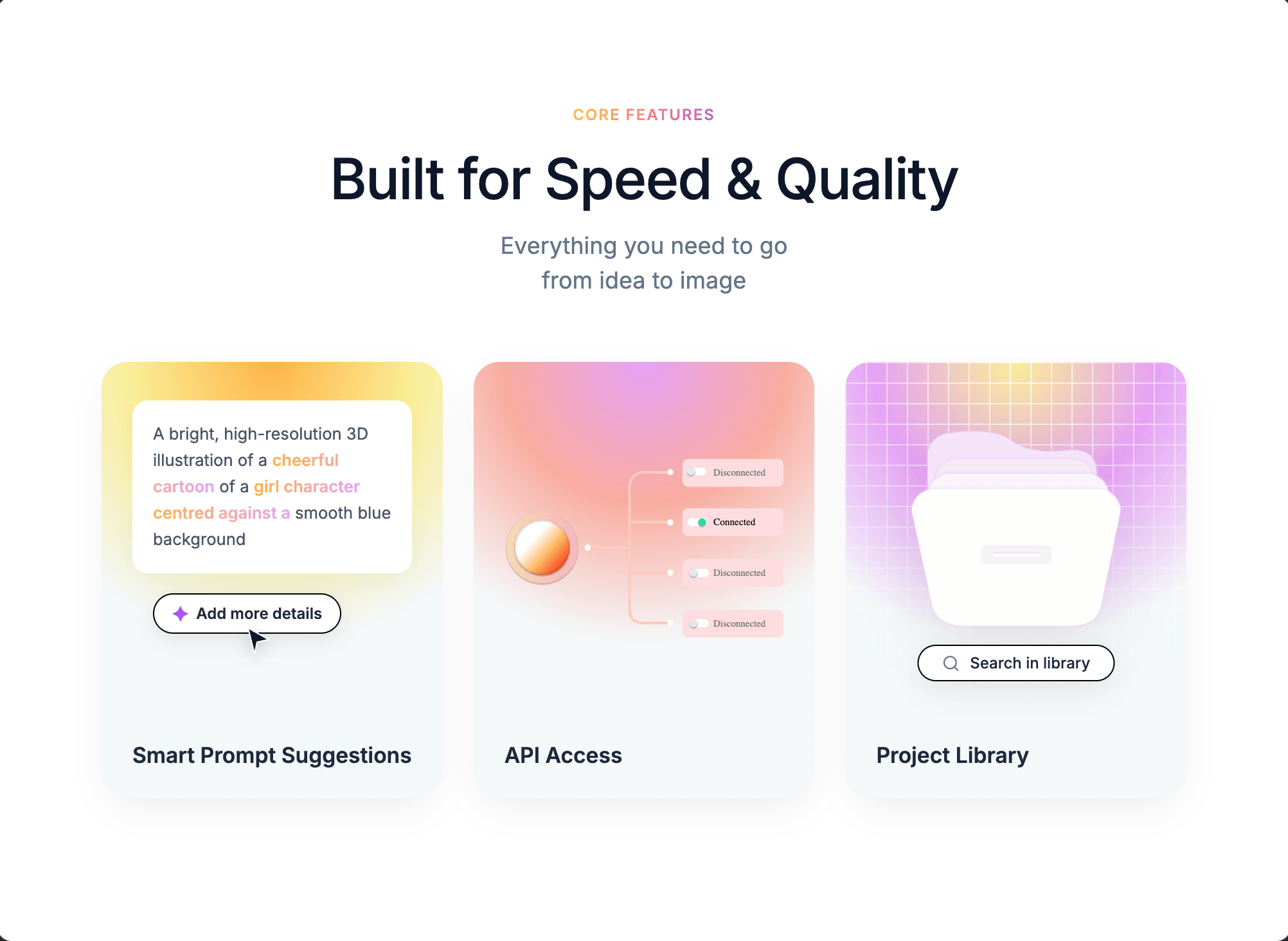
Prompt
Build a "Core Features" marketing section as a single centered component with three gradient cards. Use the Inter font family (weights 400, 500, 600) loaded from Google Fonts: `https://fonts.googleapis.com/css2?family=Inter:wght@400;500;600&display=swap`.

**Page shell:**
- Body: white background `#ffffff`, 80px top/bottom + 20px left/right padding, flex centered, Inter font.
- Global reset: `* { box-sizing: border-box; margin: 0; padding: 0; }`.

**Container (`.c1-container`):** max-width 1100px, full width, text-align center.

**Header block:**
- Badge (`.c1-badge`): text "Core Features", 0.75rem, weight 600, uppercase, letter-spacing 1px, gradient text using `linear-gradient(90deg, #F5C344, #F28482, #B567C2)` with `-webkit-background-clip: text` and transparent fill. 16px bottom margin.
- Title (`.c1-title`): "Built for Speed & Quality", font-size 2.75rem, weight 500, color `#0f172a`, letter-spacing -0.02em, 12px bottom margin.
- Subtitle (`.c1-subtitle`): "Everything you need to go" + `<br>` + "from idea to image", 1.125rem, color `#64748b`, line-height 1.5, 50px bottom margin.

**Grid (`.c1-grid`):** 3 equal columns, 24px gap. Breakpoints: 2 columns under 900px, 1 column under 600px (title scales to 2.25rem).

**Card base (`.c1-card`):** 20px border-radius, height 340px, flex column justify-end, relative, overflow hidden, text-align left, background `#F4F8F9`, shadow `0 10px 30px -10px rgba(0,0,0,0.1)`. Titles inside (`h3`): 1.05rem, weight 600, color `#1e293b`, padding 24px, z-index 2.

**Card 1 — Smart Prompt Suggestions (`.c1-card-1`):**
- Background: `radial-gradient(circle at 50% 0%, #FFB347 0%, #F9ED96 30%, #F4F8F9 60%, #F4F8F9 100%)`.
- Prompt box (white, 12px radius, 16px padding, 0.8rem text, color `#475569`, line-height 1.6, shadow `0 8px 20px rgba(0,0,0,0.04)`), absolutely positioned top:30px/left:24px/right:24px. Text: "A bright, high-resolution 3D illustration of a **cheerful cartoon** of a **girl character** **centred against a** smooth blue background" — bold phrases have class `.c1-blur-text` with gradient `linear-gradient(90deg, #FFB347, #E5A1F5)` as clipped text, weight 600.
- "Add more details" pill button: absolute top:180px/left:40px, white background, 1px solid black border, 5px 14px padding, 20px radius, 0.75rem text, weight 600, color `#1e293b`, shadow `0 4px 15px rgba(0,0,0,0.08)`, includes `✦` character styled `color: #a855f7; font-size: 1rem` with 6px gap.
- Cursor SVG arrow: absolute top:205px/left:110px, 24x24, fill `#0f172a`, white stroke 1px, drop-shadow `0 4px 6px rgba(0,0,0,0.2)`, z-index 10. Path: `M4 2L20 11L11 13L9 22L4 2Z`.
- Heading: "Smart Prompt Suggestions".

**Card 2 — API Access (`.c1-card-2`):**
- Background: `radial-gradient(circle at 50% 0%, #E5A1F5 0%, #F8ACA0 30%, #F4F8F9 60%, #F4F8F9 100%)`.
- `.c1-api-visual` absolutely positioned top:0/left:0/right:0/bottom:70px, flex centered, 24px horizontal padding.
- Image (`.c1-network-img`): width 100%, height 180px, object-fit contain, margin-top 20px. Source: `https://pub-f170a2592d2c4a1485466404c36807be.r2.dev/viktor/network.svg`.
- Heading: "API Access".

**Card 3 — Project Library (`.c1-card-3`):**
- Background: `radial-gradient(circle at 50% 0%, #F9ED96 0%, #E5A1F5 30%, #F4F8F9 60%, #F4F8F9 100%)`.
- Mesh overlay (`.c1-mesh`): absolute inset 0, background image = two linear gradients of `rgba(255,255,255,0.8) 1px, transparent 1px` (horizontal and 90deg vertical), background-size 16px 16px, masked with `radial-gradient(circle at center top, black 0%, transparent 80%)` (include `-webkit-mask-image`).
- Folder image (`.c1-folder`): absolute top:50px, horizontally centered via `left:50%; transform:translateX(-50%)`, width 170px, drop-shadow `0 15px 25px rgba(0,0,0,0.08)`. Source: `https://pub-f170a2592d2c4a1485466404c36807be.r2.dev/viktor/library%20icon.svg`.
- Search pill (`.c1-search`): absolute top:220px, centered, white background, 1px solid black, 6px 18px padding, 20px radius, 0.75rem text weight 500 color `#1e293b`, shadow `0 8px 20px rgba(0,0,0,0.06)`, white-space nowrap, 8px gap. Contains a 14x14 lucide-style search SVG (circle cx=11 cy=11 r=8, line 21,21→16.65,16.65, stroke `#64748b`, stroke-width 2, round caps/joins) followed by text "Search in library".
- Heading: "Project Library".

**Note:** No animations are defined in this component — it is purely static styling. No JavaScript behavior, no hover effects. Use Supabase if any data persistence is needed, though this section requires none.
Reusable method
Key decisions
Check whether information hierarchy, module order, and CTA clarity all hold in the final result.
Adapt it to your subject
Extract “target result → the product name, audience, page modules, and primary button → constraints” as a reusable template for similar work.
Where it breaks
Run single-variable comparisons around module order, value proposition, and CTA placement. Record the model, cost, and failures; turn it into a Skill only after it repeats reliably.
Recommended models
Derived Skill
Skills are derived from repeated patterns in published cases. They are not a separate submission type.
Creator
MotionSites focuses on production-ready AI interfaces and is active on MotionSites. “Modern Agency” is the current representative case, built with 待补充模型 with its stability retest open to votes.
Keep exploring
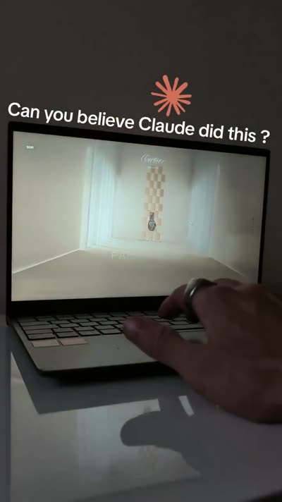
A webpage case by @Oluwaphilemon1 using Claude Fable 5 · Three.js · Blender · GSAP, including the public result, full prompt, and original source.
Prompt
Claude Fable 5 and GPT-5.6 are powerful🥵🥵🥵 Here Is How I built with Claude 👇 Prompt: "Design an agency site where services are presented as supermarket product packaging in 3D" Use Three.js with WebGL to render al
// components/ui/3d-pin.tsx "use client"; import React, { useState } from "react"; import { motion } from "motion/react"; import { cn } from "@/lib/utils"; export const PinContainer = ({ children, title, href, className, containerClassName, }: { children: React.ReactNode; title?: string; href?: string; className?: string; containerClassName?: string; }) => { const [transform, setTransform] = useState( "translate(-50%,-50%) rotateX(0deg)" ); const onMouseEnter = () => { setTransform("translate(-50%,-50%) rotateX(40deg) scale(0.8)"); }; const onMouseLeave = () => { setTransform("translate(-50%,-50%) rotateX(0deg) scale(1)"); }; return ( <a className={cn( "relative group/pin z-50 cursor-pointer", containerClassName )} onMouseEnter={onMouseEnter} onMouseLeave={onMouseLeave} href={href || "/"} > <div style={{ perspective: "1000px", transform: "rotateX(70deg) translateZ(0deg)", }} className="…
Prompt
// components/ui/3d-pin.tsx "use client"; import React, { useState } from "react"; import { motion } from "motion/react"; import { cn } from "@/lib/utils"; export const PinContainer = ({ children, title, href, className, containerClassName…
.webp)
Build a single full-viewport hero section in React + TypeScript + Vite + Tailwind CSS, using `lucide-react` for icons. The component is a character-figurine carousel called "TOONHUB". **Fonts (load in `index.html` head):** ```html <link rel="preconnect" href="https://fonts.googleapis.com" /> <link rel="preconnect" href="https://fonts.gstatic.com" crossorigin /> <link href="https://fonts.googleapis.com/css2?family=Anton&family=Inter:wght@400;500;600;700&display=swap" rel="stylesheet" /> ``` Body font: `'Inter', sans-serif`. Display font (huge ghost text + bottom-right link): `'Anton', sans-serif`. **Image data (4 items, exact URLs and colors):** ```ts const IMAGES = [ { src: 'https://fifth-gentle-45902158.figma.site/_components/v2/4de492f6d9cf8244ad5293233e5c6f52407d42fc/1.02464a56.png', bg: '#F4845F', panel: '#F79B7F' }, { src: 'https://fifth-gentle-45902158.figma.site/_components/v2/4d…
Prompt
Build a single full-viewport hero section in React + TypeScript + Vite + Tailwind CSS, using `lucide-react` for icons. The component is a character-figurine carousel called "TOONHUB". **Fonts (load in `index.html` head):** ```html <link re…
