

Loading…
Loading…
Loading the case library.
Loading…
Case library · Public evidence
Copy this TSX component source and hand it to an AI coding tool such as Cursor, v0 or Claude, noting it is the Aceternity UI implementation of Moving Border. The tool can then wire it into your React project, and you swap in your own copy, colors and trigger parameters.
Prompt
// components/ui/moving-border.tsx "use client"; import React from "react"; import { motion, useAnimationFrame, useMotionTemplate, useMotionValue, useTransform, } from "motion/react";…
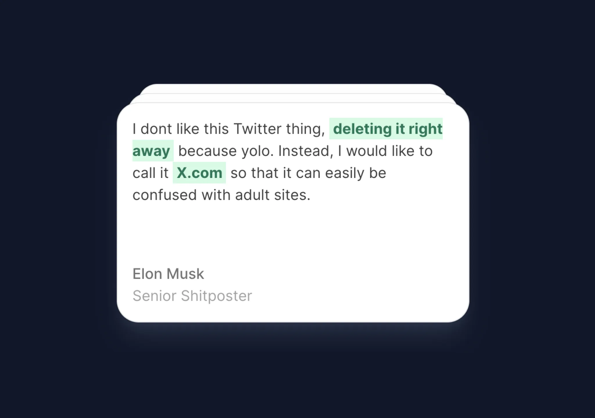
Copy this TSX component source into an AI coding tool such as Cursor, v0, or Claude, and tell it this is the Aceternity UI Card Stack component. It can then wire it into your React project, and you can swap the copy, colors, and trigger parameters to reuse it.
Prompt
// components/ui/card-stack.tsx "use client"; import { useEffect, useState } from "react"; import { motion } from "motion/react"; let interval: any; type Card = { id: number; name: string;…

Minimal black footer for the aerospace company EngineTech, with an animated dotted top edge and a four-column navigation grid.
Prompt
--- Build a **Site Footer** for an aerospace company called "EngineTech." This is a black-background footer with an animated dotted top border, a four-column nav grid with a large heading,…
Copy this TSX component source into an AI coding tool such as Cursor, v0, or Claude, and tell it this is the Aceternity UI Focus Cards component. It can then wire it into your React project, and you can swap the copy, colors, and trigger parameters to reuse it.
Prompt
// components/ui/focus-cards.tsx "use client"; import React, { useState } from "react"; import { cn } from "@/lib/utils"; export const Card = React.memo( ({ card, index, hovered,…

Copy this TSX component source into an AI coding tool such as Cursor, v0, or Claude, and tell it this is the Aceternity UI Following Pointer component. It can then wire it into your React project, and you can swap the copy, colors, and trigger parameters to reuse it.
Prompt
// components/ui/following-pointer.tsx import React, { useEffect, useState } from "react"; import { motion, AnimatePresence, useMotionValue } from "motion/react"; import { cn } from…

Full-screen hero for the travel app Wandor, built with React, TypeScript, Vite and Tailwind.
Prompt
**Build a single-page React + TypeScript landing page for a travel app called "Wandor" using Vite, Tailwind CSS, and lucide-react. The page is a full-viewport hero section with a looping…

Copy this TSX component source into an AI coding tool such as Cursor, v0, or Claude, and tell it this is the Aceternity UI Loaders component. It can then wire it into your React project, and you can swap the copy, colors, and trigger parameters to reuse it.
Prompt
// components/ui/loader.tsx "use client"; import { motion } from "motion/react"; import React from "react"; export const LoaderOne = () => { const transition = (x: number) => { return {…
Copy this TSX component source and hand it to an AI coding tool such as Cursor, v0 or Claude, noting it is the Aceternity UI implementation of Stateful Button. The tool can then wire it into your React project, and you swap in your own copy, colors and trigger parameters.
Prompt
// components/ui/stateful-button.tsx "use client"; import { cn } from "@/lib/utils"; import React from "react"; import { motion, AnimatePresence, useAnimate } from "motion/react";…

Full-screen hero built with React and Framer Motion, deliberately without Tailwind and hand-written in plain CSS, useful for comparing the two approaches.
Prompt
Create a full-screen hero section landing page using React, Vite, and Framer Motion (`motion` package). Use plain CSS (no Tailwind). The font is Inter (weights 300, 400, 500, 600) from…
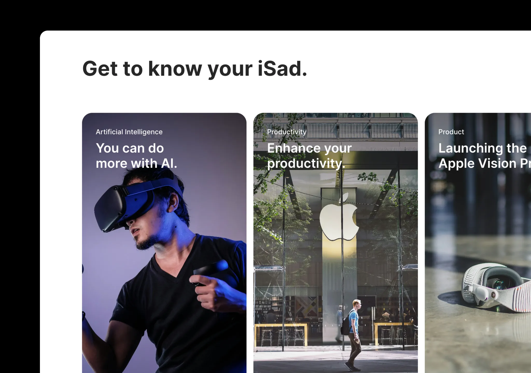
Copy this TSX component source into an AI coding tool such as Cursor, v0, or Claude, and tell it this is the Aceternity UI Apple Cards Carousel component. It can then wire it into your React project, and you can swap the copy, colors, and trigger parameters to reuse it.
Prompt
// components/ui/apple-cards-carousel.tsx "use client"; import React, { useEffect, useRef, useState, createContext, useContext, } from "react"; import { IconArrowNarrowLeft,…
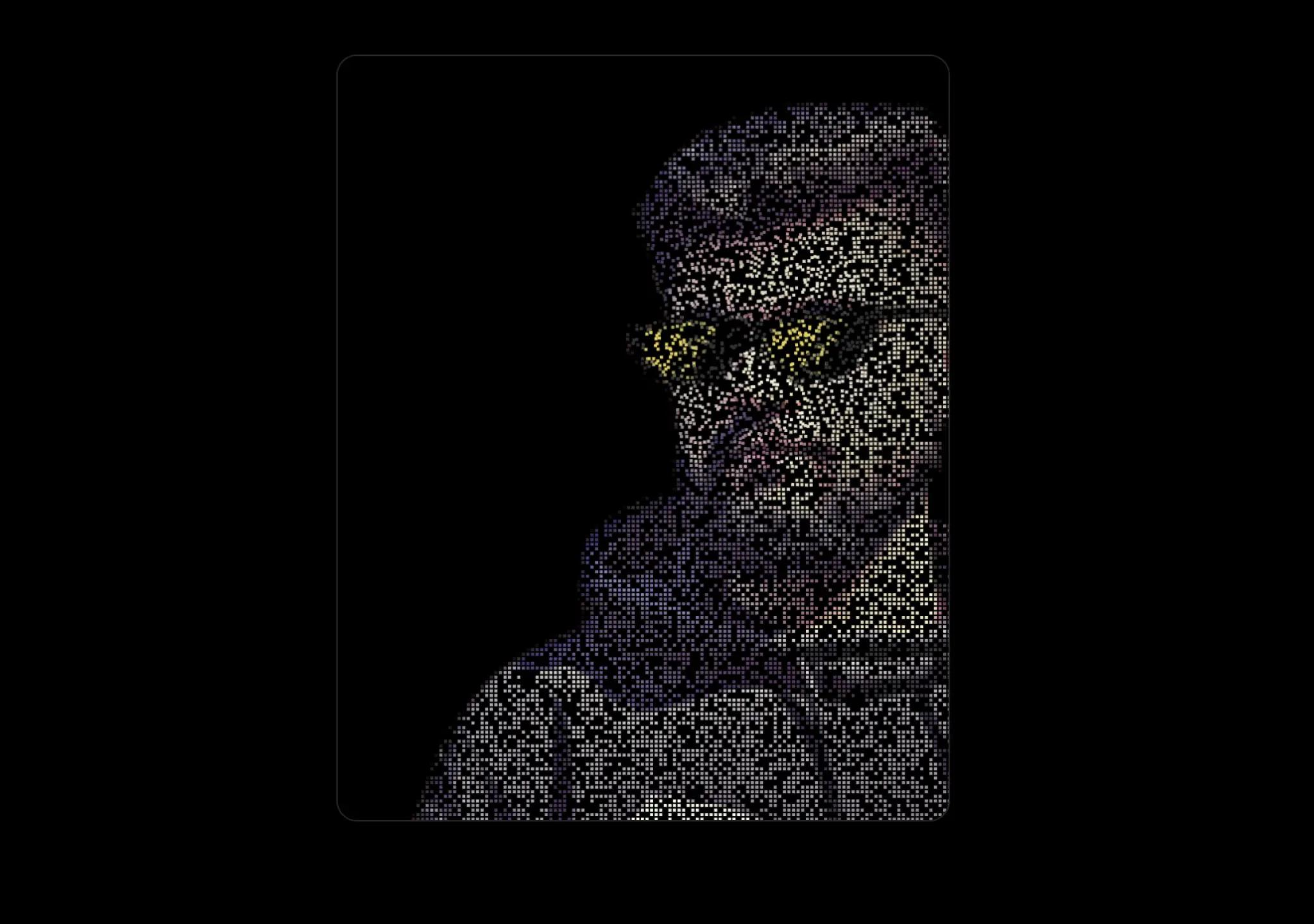
Copy this TSX component source and hand it to an AI coding tool such as Cursor, v0 or Claude, noting it is the Aceternity UI implementation of Pixelated Canvas. The tool can then wire it into your React project, and you swap in your own copy, colors and trigger parameters.
Prompt
// components/ui/pixelated-canvas.tsx "use client"; import React from "react"; type PixelatedCanvasProps = { src: string; width?: number; height?: number; /** Size of each cell (in CSS…
Pixel-level recreation of a dark-themed CTA section, built with React 18 and framer-motion, with even the composition of the cn() utility function written into the spec.
Prompt
Build a pixel-faithful recreation of the landing CTA section. Use React 18 + Vite + TypeScript, TailwindCSS, `framer-motion`, `clsx` + `tailwind-merge` as `cn()`. Dark theme background…

Copy this TSX component source into an AI coding tool such as Cursor, v0, or Claude, and tell it this is the Aceternity UI Images Badge component. It can then wire it into your React project, and you can swap the copy, colors, and trigger parameters to reuse it.
Prompt
// components/ui/images-badge.tsx "use client"; import React, { useState } from "react"; import { motion } from "motion/react"; import { cn } from "@/lib/utils"; interface ImagesBadgeProps…

Copy this TSX component source and hand it to an AI coding tool such as Cursor, v0 or Claude, noting it is the Aceternity UI implementation of Navbar Menu. The tool can then wire it into your React project, and you swap in your own copy, colors and trigger parameters.
Prompt
// components/ui/navbar-menu.tsx "use client"; import React from "react"; import { motion } from "motion/react"; const transition = { type: "spring" as const, mass: 0.5, damping: 11.5,…

Full-page marketing landing for Boomerang, a conversational AI platform for financial institutions, built with React, TypeScript and Tailwind.
Prompt
Build a single full-viewport marketing landing page for **Boomerang**, a conversational AI platform for financial institutions. Tech: React + TypeScript + Vite + Tailwind CSS + Lucide…
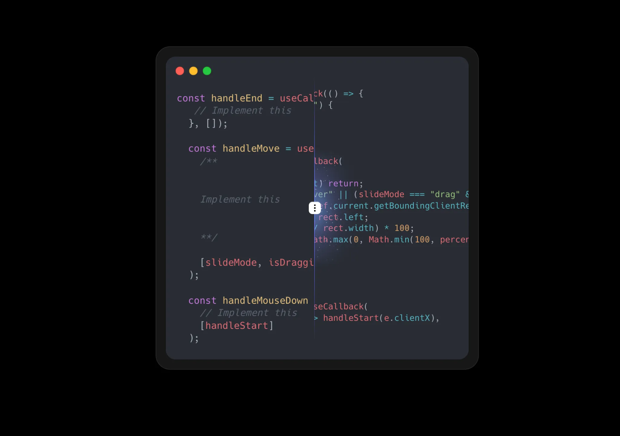
Copy this TSX component source into an AI coding tool such as Cursor, v0, or Claude, and tell it this is the Aceternity UI Compare component. It can then wire it into your React project, and you can swap the copy, colors, and trigger parameters to reuse it.
Prompt
// components/ui/compare.tsx "use client"; import React, { useState, useEffect, useRef, useCallback } from "react"; import { SparklesCore } from "@/components/ui/sparkles"; import {…

Copy this TSX component source into an AI coding tool such as Cursor, v0, or Claude, and tell it this is the Aceternity UI Background Lines component. It can then wire it into your React project, and you can swap the copy, colors, and trigger parameters to reuse it.
Prompt
// components/ui/background-lines.tsx "use client"; import { cn } from "@/lib/utils"; import { motion } from "motion/react"; import React from "react"; export const BackgroundLines = ({…

Mobile wellness quiz interface inside a phone-frame mockup, built with React and Tailwind on a centered white page. Useful for learning how to present a realistic phone shell on the web.
Prompt
Build a mobile wellness quiz screen inside a realistic phone frame mockup, centered on a white page. Use React with Tailwind CSS and Lucide React icons. **Phone Frame:** - Dimensions:…

Copy this TSX component source into an AI coding tool such as Cursor, v0, or Claude, and tell it this is the Aceternity UI Layout Text Flip component. It can then wire it into your React project, and you can swap the copy, colors, and trigger parameters to reuse it.
Prompt
// components/ui/layout-text-flip.tsx "use client"; import React, { useState, useEffect } from "react"; import { motion, AnimatePresence } from "motion/react"; import { cn } from…
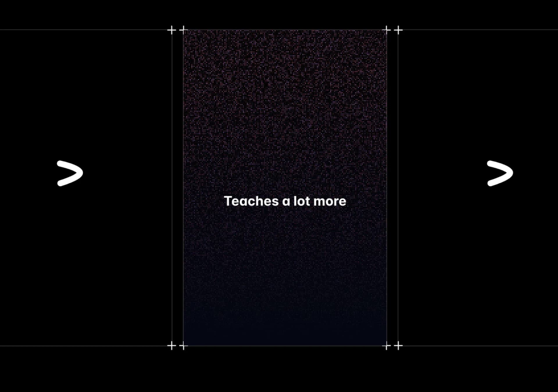
Copy this TSX component source into an AI coding tool such as Cursor, v0, or Claude, and tell it this is the Aceternity UI Canvas Reveal Effect component. It can then wire it into your React project, and you can swap the copy, colors, and trigger parameters to reuse it.
Prompt
// components/ui/canvas-reveal-effect.tsx "use client"; import { cn } from "@/lib/utils"; import { Canvas, useFrame, useThree } from "@react-three/fiber"; import React, { useMemo, useRef }…
Beauty category showcase section built with React and Tailwind, with each container spec named item by item.
Prompt
--- **Prompt to recreate the "Categories" section:** > Build a "Categories" section in React + Tailwind CSS with the following exact specifications: > > **Section Container:** > -…

Copy this TSX component source and hand it to an AI coding tool such as Cursor, v0 or Claude, noting it is the Aceternity UI implementation of Squiggly Text. The tool can then wire it into your React project, and you swap in your own copy, colors and trigger parameters.
Prompt
// components/ui/squiggly-text.tsx "use client"; import React, { useId } from "react"; import { motion, useTime, useTransform } from "motion/react"; import { cn } from "@/lib/utils";…
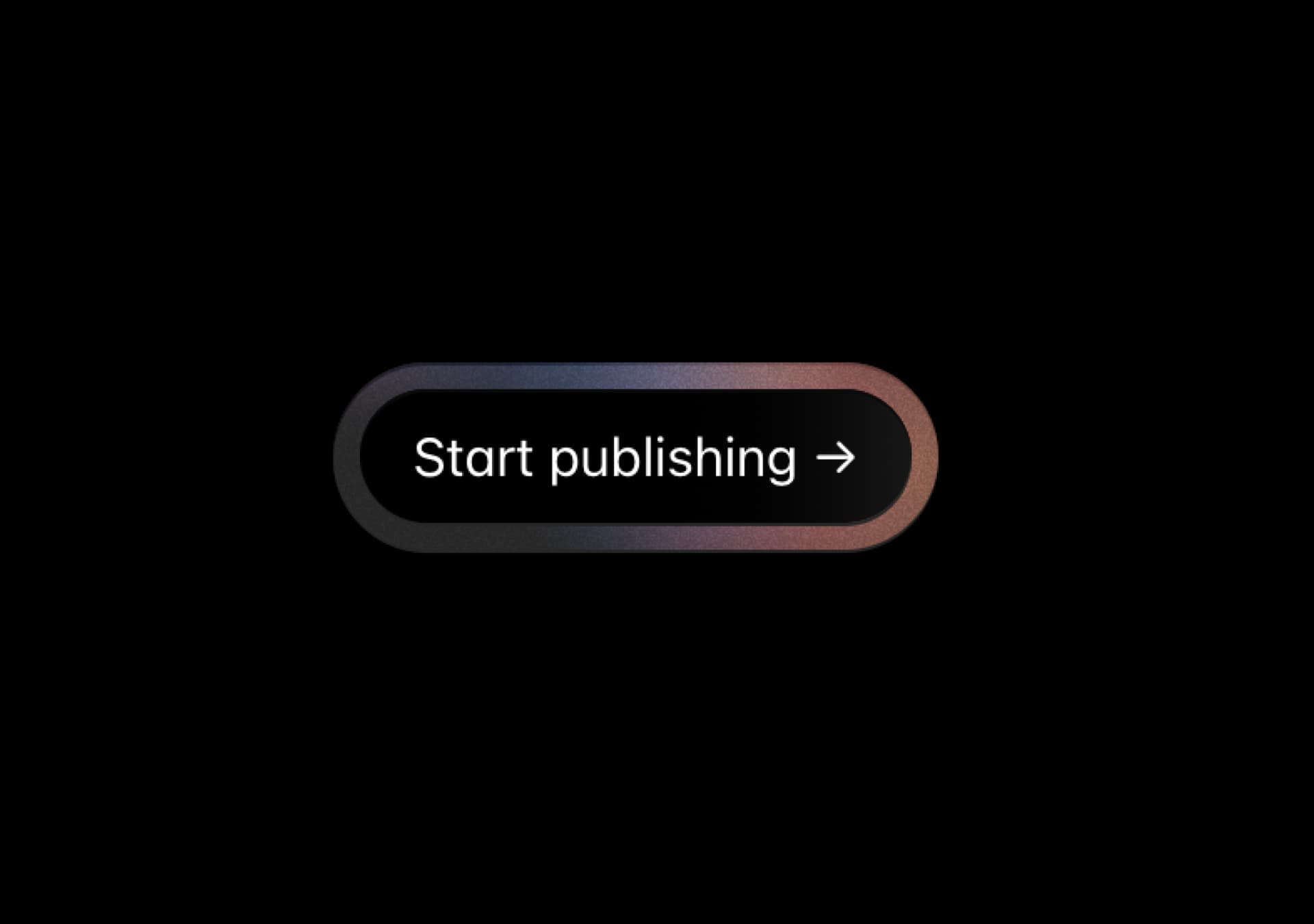
Copy this TSX component source and hand it to an AI coding tool such as Cursor, v0 or Claude, noting it is the Aceternity UI implementation of Noise Background. The tool can then wire it into your React project, and you swap in your own copy, colors and trigger parameters.
Prompt
// components/ui/noise-background.tsx "use client"; import { cn } from "@/lib/utils"; import { motion, useAnimationFrame, useMotionTemplate, useMotionValue, useSpring, useTransform,…

Editorial personal portfolio hero in black and cream, with cards, purple and Inter explicitly banned. The anti-AI-look constraints are written straight into the prompt.
Prompt
Recreate this page **pixel-faithfully**. Single full-viewport hero. React + Tailwind CSS. No cards, no purple, no Inter/Roboto. Black/cream editorial portfolio look. --- ## Stack & page…