Loading…
Creator · Aceternity UI
View original source ↗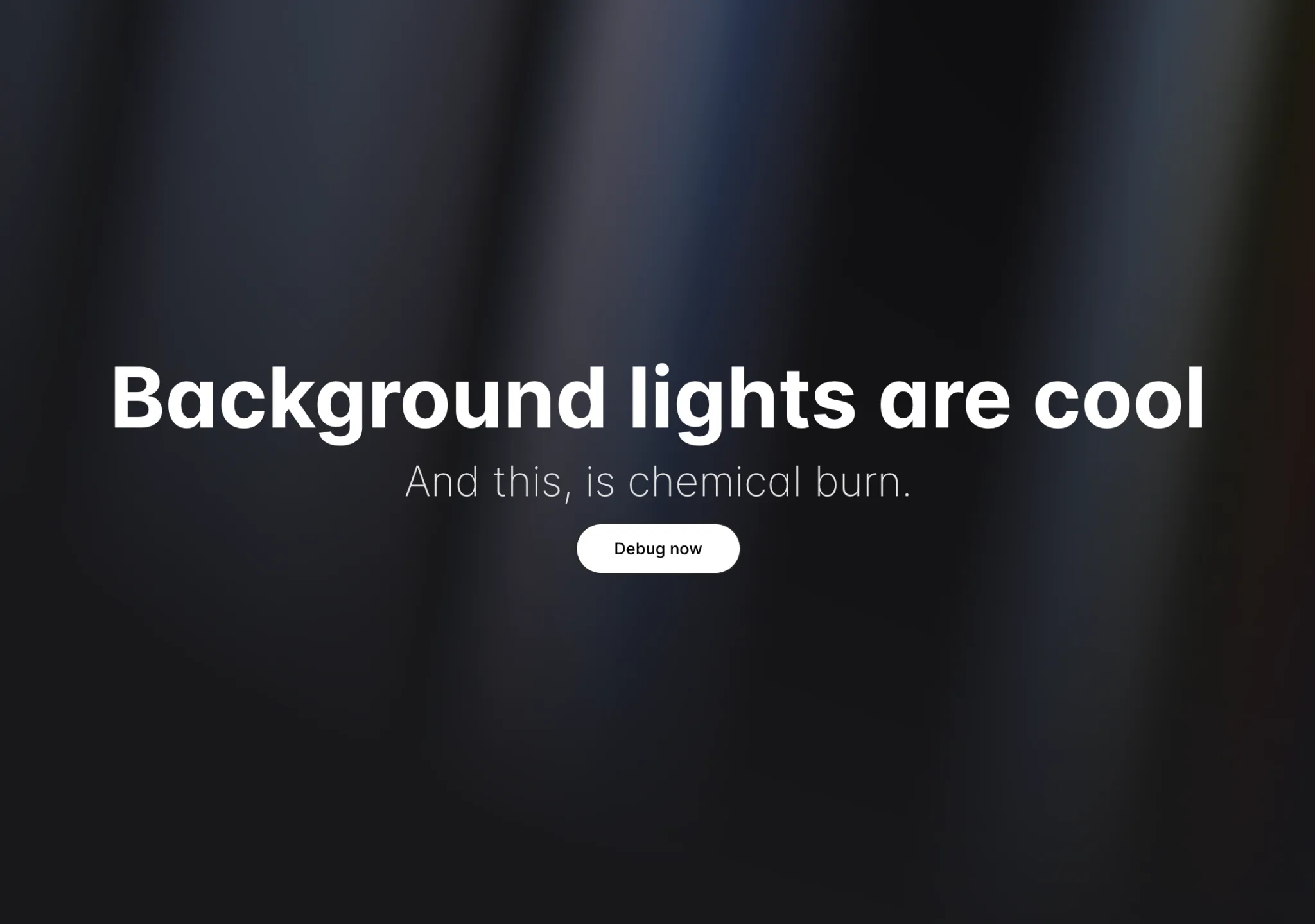
Prompt
// components/ui/aurora-background.tsx
"use client";
import { cn } from "@/lib/utils";
import React, { ReactNode } from "react";

interface AuroraBackgroundProps extends React.HTMLProps<HTMLDivElement> {
  children: ReactNode;
  showRadialGradient?: boolean;
}

export const AuroraBackground = ({
  className,
  children,
  showRadialGradient = true,
  ...props
}: AuroraBackgroundProps) => {
  return (
    <main>
      <div
        className={cn(
          "transition-bg relative flex h-[100vh] flex-col items-center justify-center bg-zinc-50 text-slate-950 dark:bg-zinc-900",
          className,
        )}
        {...props}
      >
        <div
          className="absolute inset-0 overflow-hidden"
          style={
            {
              "--aurora":
                "repeating-linear-gradient(100deg,#3b82f6_10%,#a5b4fc_15%,#93c5fd_20%,#ddd6fe_25%,#60a5fa_30%)",
              "--dark-gradient":
                "repeating-linear-gradient(100deg,#000_0%,#000_7%,transparent_10%,transparent_12%,#000_16%)",
              "--white-gradient":
                "repeating-linear-gradient(100deg,#fff_0%,#fff_7%,transparent_10%,transparent_12%,#fff_16%)",

              "--blue-300": "#93c5fd",
              "--blue-400": "#60a5fa",
              "--blue-500": "#3b82f6",
              "--indigo-300": "#a5b4fc",
              "--violet-200": "#ddd6fe",
              "--black": "#000",
              "--white": "#fff",
              "--transparent": "transparent",
            } as React.CSSProperties
          }
        >
          <div
            //   I'm sorry but this is what peak developer performance looks like // trigger warning
            className={cn(
              `after:animate-aurora pointer-events-none absolute -inset-[10px] [background-image:var(--white-gradient),var(--aurora)] [background-size:300%,_200%] [background-position:50%_50%,50%_50%] opacity-50 blur-[10px] invert filter will-change-transform [--aurora:repeating-linear-gradient(100deg,var(--blue-500)_10%,var(--indigo-300)_15%,var(--blue-300)_20%,var(--violet-200)_25%,var(--blue-400)_30%)] [--dark-gradient:repeating-linear-gradient(100deg,var(--black)_0%,var(--black)_7%,var(--transparent)_10%,var(--transparent)_12%,var(--black)_16%)] [--white-gradient:repeating-linear-gradient(100deg,var(--white)_0%,var(--white)_7%,var(--transparent)_10%,var(--transparent)_12%,var(--white)_16%)] after:absolute after:inset-0 after:[background-image:var(--white-gradient),var(--aurora)] after:[background-size:200%,_100%] after:[background-attachment:fixed] after:mix-blend-difference after:content-[""] dark:[background-image:var(--dark-gradient),var(--aurora)] dark:invert-0 after:dark:[background-image:var(--dark-gradient),var(--aurora)]`,

              showRadialGradient &&
                `[mask-image:radial-gradient(ellipse_at_100%_0%,black_10%,var(--transparent)_70%)]`,
            )}
          ></div>
        </div>
        {children}
      </div>
    </main>
  );
};Models & stability
Recommended models
Keep exploring

A webpage case by @Oluwaphilemon1 using Claude Fable 5 · Three.js · Blender · GSAP, including the public result, full prompt, and original source.
Prompt
Claude Fable 5 and GPT-5.6 are powerful🥵🥵🥵 Here Is How I built with Claude 👇 Prompt: "Design an agency site where services are presented as supermarket product packaging in 3D" Use Three.js with WebGL to render al
复制这段 TSX 组件源码,交给 Cursor、v0、Claude 等 AI 编程工具,说明这是「3D Animated Pin」的 Aceternity UI 组件实现,即可让它接入你的 React 项目,再按需替换文案、配色与触发参数复用。
Prompt
// components/ui/3d-pin.tsx "use client"; import React, { useState } from "react"; import { motion } from "motion/react"; import { cn } from "@/lib/utils"; export const PinContainer = ({ children, title, href, className, containerClassName…

一个复杂的提示词,用于利用 Three.js 风格优化和逼真光照,在浏览器中生成精细的实时 3D 森林环境。
Prompt
First search for the "/unlazy" skill, read it fully, and use it throughout the entire task. Treat this as a major visual build lasting at least {argument name="minimum duration" d

