加载中…
创作者 · Aceternity UI
查看原始来源 ↗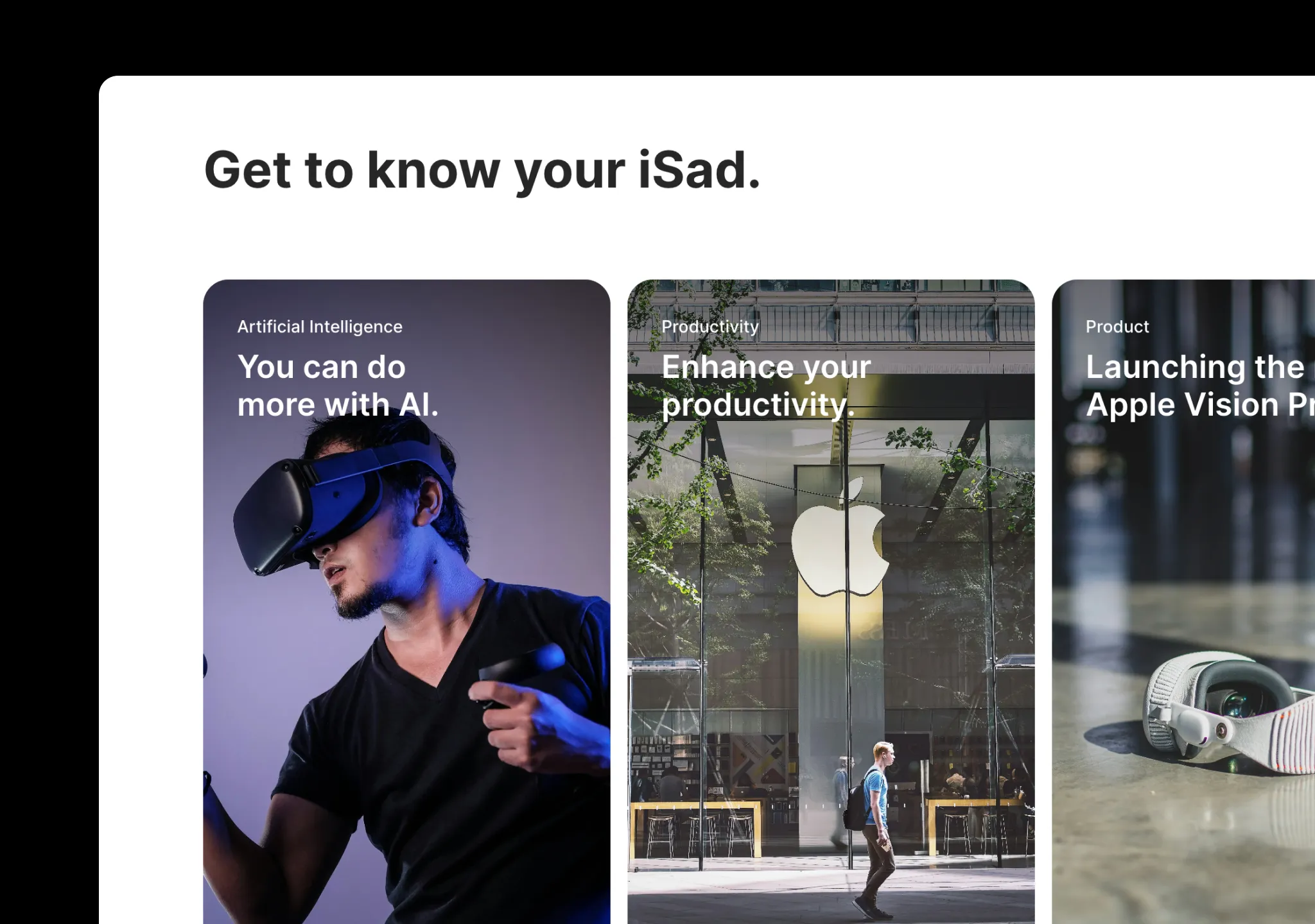
Prompt
// components/ui/apple-cards-carousel.tsx
"use client";
import React, {
  useEffect,
  useRef,
  useState,
  createContext,
  useContext,
} from "react";
import {
  IconArrowNarrowLeft,
  IconArrowNarrowRight,
  IconX,
} from "@tabler/icons-react";
import { cn } from "@/lib/utils";
import { AnimatePresence, motion } from "motion/react";
import Image, { ImageProps } from "next/image";
import { useOutsideClick } from "@/hooks/use-outside-click";

interface CarouselProps {
  items: JSX.Element[];
  initialScroll?: number;
}

type Card = {
  src: string;
  title: string;
  category: string;
  content: React.ReactNode;
};

export const CarouselContext = createContext<{
  onCardClose: (index: number) => void;
  currentIndex: number;
}>({
  onCardClose: () => {},
  currentIndex: 0,
});

export const Carousel = ({ items, initialScroll = 0 }: CarouselProps) => {
  const carouselRef = React.useRef<HTMLDivElement>(null);
  const [canScrollLeft, setCanScrollLeft] = React.useState(false);
  const [canScrollRight, setCanScrollRight] = React.useState(true);
  const [currentIndex, setCurrentIndex] = useState(0);

  useEffect(() => {
    if (carouselRef.current) {
      carouselRef.current.scrollLeft = initialScroll;
      checkScrollability();
    }
  }, [initialScroll]);

  const checkScrollability = () => {
    if (carouselRef.current) {
      const { scrollLeft, scrollWidth, clientWidth } = carouselRef.current;
      setCanScrollLeft(scrollLeft > 0);
      setCanScrollRight(scrollLeft < scrollWidth - clientWidth);
    }
  };

  const scrollLeft = () => {
    if (carouselRef.current) {
      carouselRef.current.scrollBy({ left: -300, behavior: "smooth" });
    }
  };

  const scrollRight = () => {
    if (carouselRef.current) {
      carouselRef.current.scrollBy({ left: 300, behavior: "smooth" });
    }
  };

  const handleCardClose = (index: number) => {
    if (carouselRef.current) {
      const cardWidth = isMobile() ? 230 : 384; // (md:w-96)
      const gap = isMobile() ? 4 : 8;
      const scrollPosition = (cardWidth + gap) * (index + 1);
      carouselRef.current.scrollTo({
        left: scrollPosition,
        behavior: "smooth",
      });
      setCurrentIndex(index);
    }
  };

  const isMobile = () => {
    return window && window.innerWidth < 768;
  };

  return (
    <CarouselContext.Provider
      value={{ onCardClose: handleCardClose, currentIndex }}
    >
      <div className="relative w-full">
        <div
          className="flex w-full overflow-x-scroll overscroll-x-auto scroll-smooth py-10 [scrollbar-width:none] md:py-20"
          ref={carouselRef}
          onScroll={checkScrollability}
        >
          <div
            className={cn(
              "absolute right-0 z-[1000] h-auto w-[5%] overflow-hidden bg-gradient-to-l",
            )}
          ></div>

          <div
            className={cn(
              "flex flex-row justify-start gap-4 pl-4",
              "mx-auto max-w-7xl", // remove max-w-4xl if you want the carousel to span the full width of its container
            )}
          >
            {items.map((item, index) => (
              <motion.div
                initial={{
                  opacity: 0,
                  y: 20,
                }}
                animate={{
                  opacity: 1,
                  y: 0,
                  transition: {
                    duration: 0.5,
                    delay: 0.2 * index,
                    ease: "easeOut",
                  },
                }}
                key={"card" + index}
                className="rounded-3xl last:pr-[5%] md:last:pr-[33%]"
              >
                {item}
              </motion.div>
            ))}
          </div>
        </div>
        <div className="mr-10 flex justify-end gap-2">
          <button
            className="relative z-40 flex h-10 w-10 items-center justify-center rounded-full bg-gray-100 disabled:opacity-50"
            onClick={scrollLeft}
            disabled={!canScrollLeft}
          >
            <IconArrowNarrowLeft className="h-6 w-6 text-gray-500" />
          </button>
          <button
            className="relative z-40 flex h-10 w-10 items-center justify-center rounded-full bg-gray-100 disabled:opacity-50"
            onClick={scrollRight}
            disabled={!canScrollRight}
          >
            <IconArrowNarrowRight className="h-6 w-6 text-gray-500" />
          </button>
        </div>
      </div>
    </CarouselContext.Provider>
  );
};

export const Card = ({
  card,
  index,
  layout = false,
}: {
  card: Card;
  index: number;
  layout?: boolean;
}) => {
  const [open, setOpen] = useState(false);
  const containerRef = useRef<HTMLDivElement>(null);
  const { onCardClose, currentIndex } = useContext(CarouselContext);

  useEffect(() => {
    function onKeyDown(event: KeyboardEvent) {
      if (event.key === "Escape") {
        handleClose();
      }
    }

    if (open) {
      document.body.style.overflow = "hidden";
    } else {
      document.body.style.overflow = "auto";
    }

    window.addEventListener("keydown", onKeyDown);
    return () => window.removeEventListener("keydown", onKeyDown);
  }, [open]);

  useOutsideClick(containerRef, () => handleClose());

  const handleOpen = () => {
    setOpen(true);
  };

  const handleClose = () => {
    setOpen(false);
    onCardClose(index);
  };

  return (
    <>
      <AnimatePresence>
        {open && (
          <div className="fixed inset-0 z-50 h-screen overflow-auto">
            <motion.div
              initial={{ opacity: 0 }}
              animate={{ opacity: 1 }}
              exit={{ opacity: 0 }}
              className="fixed inset-0 h-full w-full bg-black/80 backdrop-blur-lg"
            />
            <motion.div
              initial={{ opacity: 0 }}
              animate={{ opacity: 1 }}
              exit={{ opacity: 0 }}
              ref={containerRef}
              layoutId={layout ? `card-${card.title}` : undefined}
              className="relative z-[60] mx-auto my-10 h-fit max-w-5xl rounded-3xl bg-white p-4 font-sans md:p-10 dark:bg-neutral-900"
            >
              <button
                className="sticky top-4 right-0 ml-auto flex h-8 w-8 items-center justify-center rounded-full bg-black dark:bg-white"
                onClick={handleClose}
              >
                <IconX className="h-6 w-6 text-neutral-100 dark:text-neutral-900" />
              </button>
              <motion.p
                layoutId={layout ? `category-${card.title}` : undefined}
                className="text-base font-medium text-black dark:text-white"
              >
                {card.category}
              </motion.p>
              <motion.p
                layoutId={layout ? `title-${card.title}` : undefined}
                className="mt-4 text-2xl font-semibold text-neutral-700 md:text-5xl dark:text-white"
              >
                {card.title}
              </motion.p>
              <div className="py-10">{card.content}</div>
            </motion.div>
          </div>
        )}
      </AnimatePresence>
      <motion.button
        layoutId={layout ? `card-${card.title}` : undefined}
        onClick={handleOpen}
        className="relative z-10 flex h-80 w-56 flex-col items-start justify-start overflow-hidden rounded-3xl bg-gray-100 md:h-[40rem] md:w-96 dark:bg-neutral-900"
      >
        <div className="pointer-events-none absolute inset-x-0 top-0 z-30 h-full bg-gradient-to-b from-black/50 via-transparent to-transparent" />
        <div className="relative z-40 p-8">
          <motion.p
            layoutId={layout ? `category-${card.category}` : undefined}
            className="text-left font-sans text-sm font-medium text-white md:text-base"
          >
            {card.category}
          </motion.p>
          <motion.p
            layoutId={layout ? `title-${card.title}` : undefined}
            className="mt-2 max-w-xs text-left font-sans text-xl font-semibold [text-wrap:balance] text-white md:text-3xl"
          >
            {card.title}
          </motion.p>
        </div>
        <BlurImage
          src={card.src}
          alt={card.title}
          fill
          className="absolute inset-0 z-10 object-cover"
        />
      </motion.button>
    </>
  );
};

export const BlurImage = ({
  height,
  width,
  src,
  className,
  alt,
  ...rest
}: ImageProps) => {
  const [isLoading, setLoading] = useState(true);
  return (
    <img
      className={cn(
        "h-full w-full transition duration-300",
        isLoading ? "blur-sm" : "blur-0",
        className,
      )}
      onLoad={() => setLoading(false)}
      src={src as string}
      width={width}
      height={height}
      loading="lazy"
      decoding="async"
      blurDataURL={typeof src === "string" ? src : undefined}
      alt={alt ? alt : "Background of a beautiful view"}
      {...rest}
    />
  );
};

// hooks/use-outside-click.tsx
import React, { useEffect } from "react";

export const useOutsideClick = (
  ref: React.RefObject<HTMLDivElement>,
  callback: Function
) => {
  useEffect(() => {
    const listener = (event: any) => {
      // DO NOTHING if the element being clicked is the target element or their children
      if (!ref.current || ref.current.contains(event.target)) {
        return;
      }
      callback(event);
    };

    document.addEventListener("mousedown", listener);
    document.addEventListener("touchstart", listener);

    return () => {
      document.removeEventListener("mousedown", listener);
      document.removeEventListener("touchstart", listener);
    };
  }, [ref, callback]);
};适用模型与稳定度
建议模型
继续探索

@Oluwaphilemon1 使用 Claude Fable 5 · Three.js · Blender · GSAP完成的网页案例,包含公开结果、完整 Prompt 与原始来源。
提示语
Claude Fable 5 和 GPT-5.6 很强🥵🥵🥵 下面是我如何使用 Claude 构建的 👇 提示词:「设计一个机构网站,把服务以 3D 超市商品包装的形式呈现」 使用 Three.js 和 WebGL 在浏览器中实时渲染所有产品 使用 Blender 制作包装模型,然后导出为 GLTF 以加载到 Three.js 中 使用 GSAP 实现流畅的产品旋转和悬停交互 如果你想做一个让客户感觉像是在购买高级商品的作品集,请保存这条 🛒
复制这段 TSX 组件源码,交给 Cursor、v0、Claude 等 AI 编程工具,说明这是「3D Animated Pin」的 Aceternity UI 组件实现,即可让它接入你的 React 项目,再按需替换文案、配色与触发参数复用。
提示语
// components/ui/3d-pin.tsx "use client"; import React, { useState } from "react"; import { motion } from "motion/react"; import { cn } from "@/lib/utils"; export const PinContainer = ({ children, title, href, className, containerClassName…

提示语
首先搜索 "/unlazy" skill,完整阅读它,并在整个任务中持续使用。 将此视为一项至少持续 {argument name="minimum duration" default="5 小时"} 的大型视觉构建。如果环境允许,最好进行 {argument name="optimal duration" default="8–24 小时"} 有实质意义的实现和迭代。不要在制作出一个还不错的场景后就停下。 在浏览器中创建一个细节极其丰富的实时 {argument nam

