

Loading…
Loading…
Loading the case library.
Loading…
Case library · Public evidence

A single-file HTML footer for a sales automation brand, with all styles and scripts inline so it is self-contained and opens with a double-click, useful for learning component-level delivery.
Prompt
Build a single-file HTML footer component called Kresna — a sales-automation SaaS brand. The deliverable is one self-contained .html file with inline <style> and inline <script>. Render it…
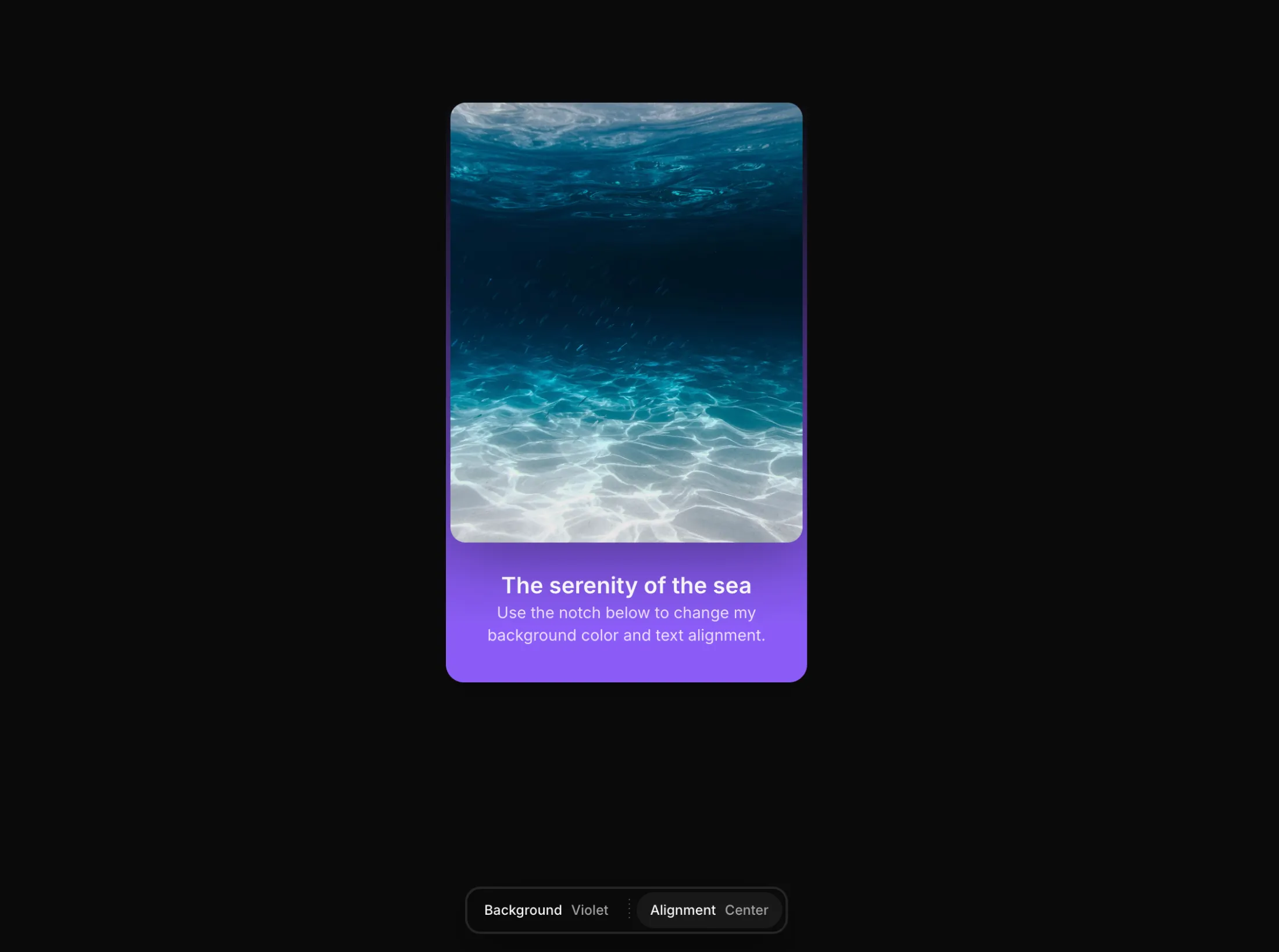
Copy this TSX component source and hand it to an AI coding tool such as Cursor, v0 or Claude, noting it is the Aceternity UI implementation of Notch. The tool can then wire it into your React project, and you swap in your own copy, colors and trigger parameters.
Prompt
// components/ui/notch.tsx "use client"; import React, { useEffect, useId, useRef, useState } from "react"; import { AnimatePresence, motion } from "motion/react"; import { cn } from…

Hero that requires an exact item-by-item recreation, with a full-screen video absolutely positioned to fill the viewport. Implementation details such as object-cover are written right into the prompt.
Prompt
Recreate this hero section exactly. Here are the complete specifications: Video Background: Full-screen background video, absolutely positioned, covering the entire viewport (object-cover)…

Glassmorphism hero for a DeFi dashboard, with specs down to the dependency list. The premium feel comes mainly from the transparency and edge treatment of the glass layers.
Prompt
Build a Hero section for a DeFi dashboard named RIVR showcasing a sleek, glassmorphism aesthetic. Please mimic these exact specifications to ensure a premium UI. Dependencies: - Use…
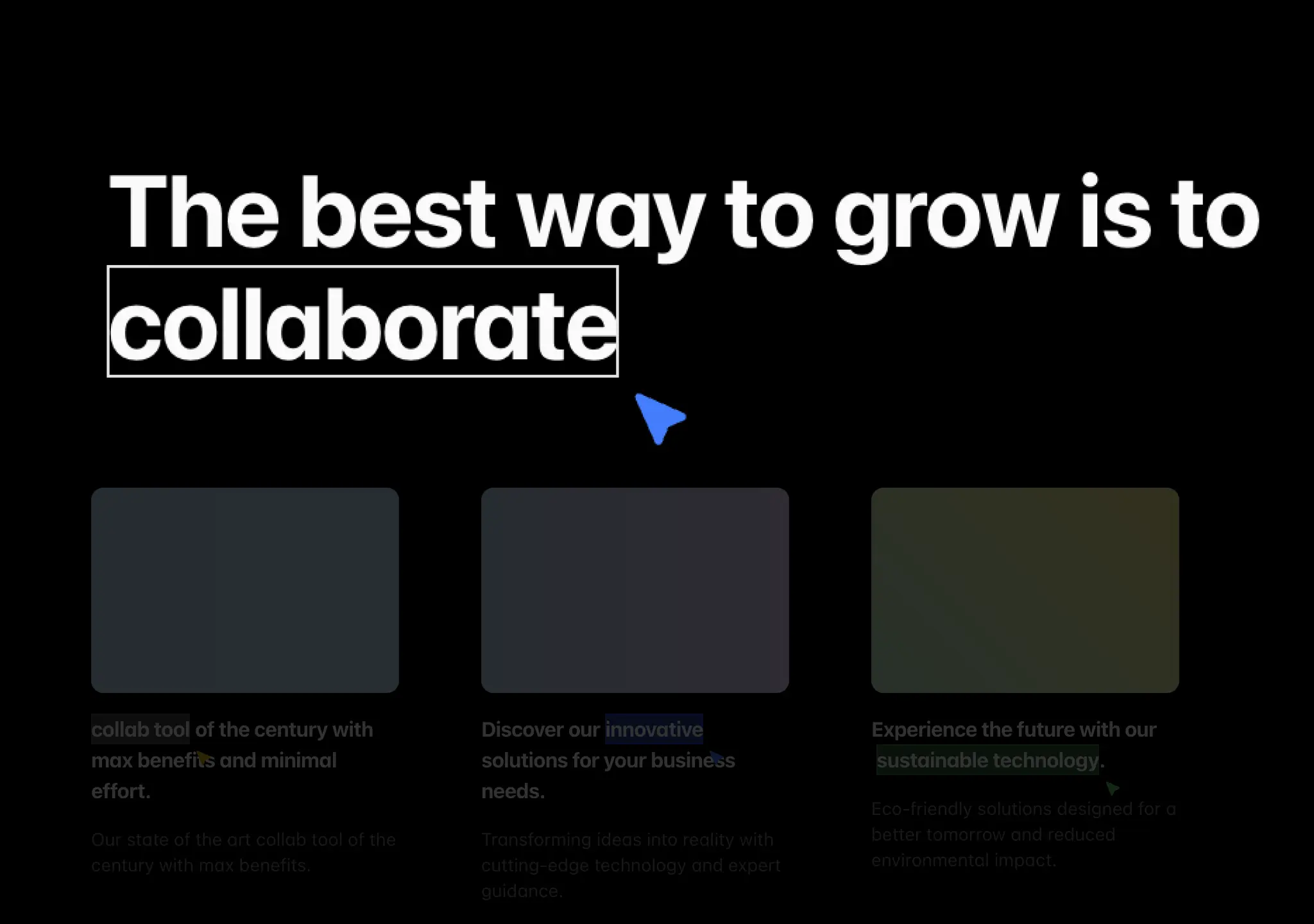
Copy this TSX component source and hand it to an AI coding tool such as Cursor, v0 or Claude, noting it is the Aceternity UI implementation of Pointer Highlight. The tool can then wire it into your React project, and you swap in your own copy, colors and trigger parameters.
Prompt
// components/ui/pointer-highlight.tsx "use client"; import { cn } from "@/lib/utils"; import { motion } from "motion/react"; import { useRef, useEffect, useState } from "react"; export…

Full-screen HLS streaming video background with a glassmorphism navigation bar and hero content anchored at the bottom left. Using HLS rather than mp4 is the engineering difference.
Prompt
Create a modern React landing page with a full-screen HLS video background, glassmorphic navigation header, and hero content positioned in the bottom-left corner.

Dark hero for a security company that uses an embedded Spline 3D scene as the background instead of the usual video. Connecting @splinetool into React and shadcn/ui is the main interest.
Prompt
Create a full-screen dark hero landing page for a security company called "SENTINEL AI" using React, Vite, TypeScript, Tailwind CSS, shadcn/ui, and an embedded Spline 3D scene as the…

Copy this TSX component source and hand it to an AI coding tool such as Cursor, v0 or Claude, noting it is the Aceternity UI implementation of Text Hover Effect. The tool can then wire it into your React project, and you swap in your own copy, colors and trigger parameters.
Prompt
// components/ui/text-hover-effect.tsx "use client"; import React, { useRef, useEffect, useState } from "react"; import { motion } from "motion/react"; export const TextHoverEffect = ({…

Four-section dark space-themed NFT landing page with a CloudFront video background and a liquid-glass UI, and its own system of colors and fonts. A rare complete multi-section page in this batch.
Prompt
Create an NFT landing page called "Orbis.Nft" with 4 sections, using a dark space theme. The page uses video backgrounds served from CloudFront, a liquid glass UI effect, and a specific…

One-page white design studio site built with React, TypeScript, Tailwind and lucide-react icons. The interest is how a two-typeface system carries a premium feel on a minimal white page.
Prompt
Create a single-page landing page for a creative design studio called "Viktor Oddy" using React, TypeScript, Vite, and Tailwind CSS. Use lucide-react for icons. The page has a white…
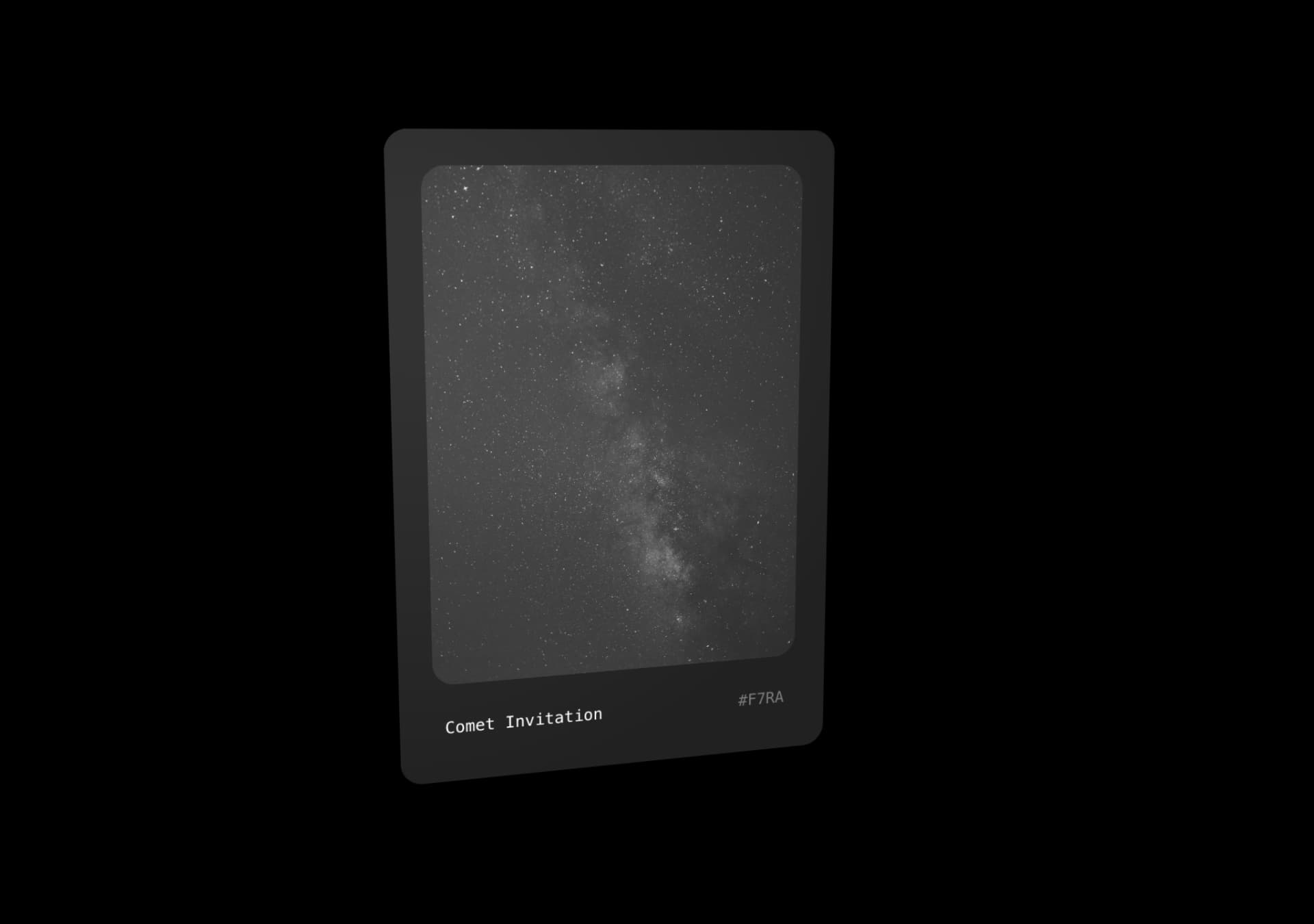
Copy this TSX component source into an AI coding tool such as Cursor, v0, or Claude, and tell it this is the Aceternity UI Comet Card component. It can then wire it into your React project, and you can swap the copy, colors, and trigger parameters to reuse it.
Prompt
// components/ui/comet-card.tsx "use client"; import React, { useRef } from "react"; import { motion, useMotionValue, useSpring, useTransform, useMotionTemplate, } from "motion/react";…

Full-screen hero for a design education platform. The looping video background gives its CloudFront source URL directly, so even the asset URL is in the prompt and recreating it needs no guesswork.
Prompt
Create a full-screen hero section for a product design education platform called "DesignPro" with the following exact specifications: Background: Full-screen looping video background using…

Light liquid-glass hero on a white background with a 1600px-wide layout and layered gradient glows at the top left for atmosphere. Light glassmorphism is harder to pull off than dark, and this entry gives the full parameters.
Prompt
System Prompt: High-Fidelity "Liquid Glass" Hero Section Core Layout: Create a 1600px max-width landing page hero section. The background should be pure white with a subtle, layered…
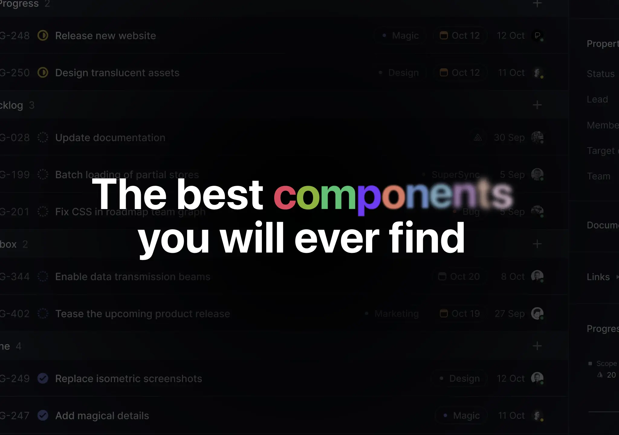
Copy this TSX component source into an AI coding tool such as Cursor, v0, or Claude, and tell it this is the Aceternity UI Colourful Text component. It can then wire it into your React project, and you can swap the copy, colors, and trigger parameters to reuse it.
Prompt
// components/ui/colourful-text.tsx "use client"; import React from "react"; import { motion } from "motion/react"; export default function ColourfulText({ text }: { text: string }) {…

Dark one-page portfolio using GSAP and Framer Motion together with hls.js video streaming. It sets the global design system first and then expands section by section, so the prompt structure itself is a template.
Prompt
Prompt to recreate this landing page: Build a single-page dark portfolio landing page using React + Vite + Tailwind CSS + TypeScript + GSAP + Framer Motion + hls.js. --- ## Global Design…

Modern hero with a looping video background, with the video URL, fonts and spacing all written as detailed specs. A standard template for a video-backed first screen.
Prompt
HERO SECTION CREATION PROMPT Create a modern hero section with a looping video background and the following specifications: Video Background: URL:…

Copy this TSX component source into an AI coding tool such as Cursor, v0, or Claude, and tell it this is the Aceternity UI 3D Animated Pin component. It can then wire it into your React project, and you can swap the copy, colors, and trigger parameters to reuse it.
Prompt
// components/ui/3d-pin.tsx "use client"; import React, { useState } from "react"; import { motion } from "motion/react"; import { cn } from "@/lib/utils"; export const PinContainer = ({…

Dark monochrome newsletter landing page built with React, shadcn/ui and Framer Motion. The font strategy of Inter paired with italic Instrument Serif can be reused as a whole.
Prompt
Build a dark monochrome landing page called Mindloop — a newsletter/content platform. Use React + Vite + TypeScript + Tailwind CSS + shadcn/ui + Framer Motion. Fonts: Inter (sans) and…

Dark landing page for an analytics dashboard SaaS, built with React, Framer Motion and shadcn/ui, with fonts split between body and headings. A standard SaaS website skeleton.
Prompt
Create a dark landing page for "Neuralyn" — an analytics dashboard SaaS. Use React + Vite + Tailwind CSS + TypeScript + Framer Motion + shadcn/ui. Fonts Inter (400, 500, 600, 700) for…
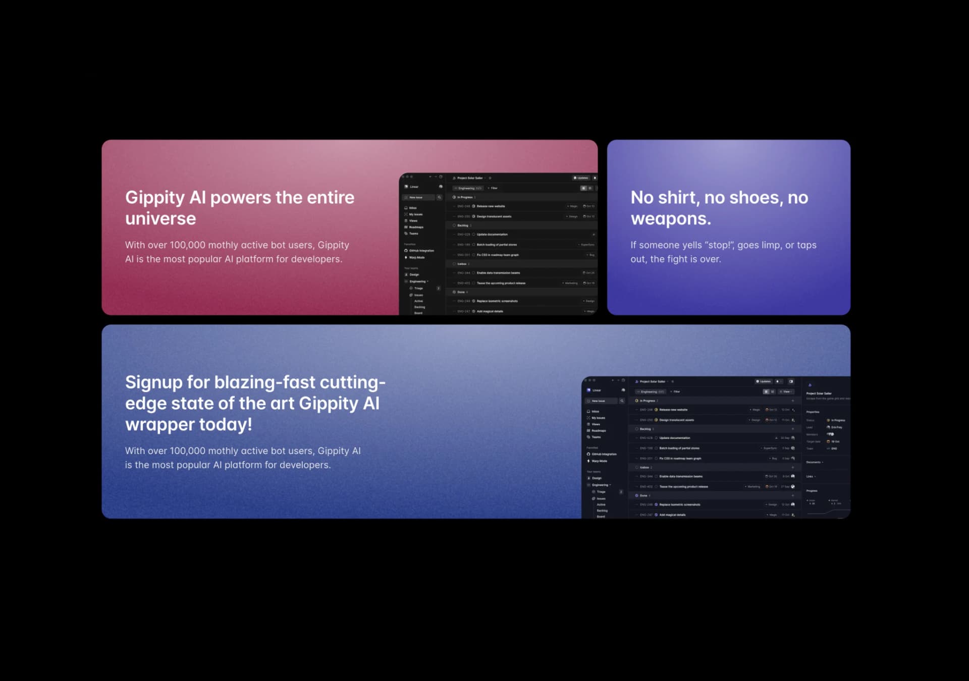
Copy this TSX component source and hand it to an AI coding tool such as Cursor, v0 or Claude, noting it is the Aceternity UI implementation of Wobble Card. The tool can then wire it into your React project, and you swap in your own copy, colors and trigger parameters.
Prompt
// components/ui/wobble-card.tsx "use client"; import React, { useState } from "react"; import { motion } from "motion/react"; import { cn } from "@/lib/utils"; export const WobbleCard =…

SaaS first screen where the navigation and hero fill exactly 100vh with scrolling disabled. The layout constraints are all written as Tailwind class names, so copying them is enough.
Prompt
Create a SaaS landing page hero section with the following exact specifications: Page Layout The entire page is h-screen flex flex-col bg-background overflow-hidden — the Navbar + Hero…

Full-screen hero for a booking app, with three Google fonts assigned to the UI, buttons and headings. The prompt sets up the design system before the layout, a structure worth copying.
Prompt
Create a responsive, full-screen hero section for a web application using React and Tailwind CSS. Design System & Assets: Fonts: Load and use 'Manrope' (for UI/Nav), 'Cabin' (for…
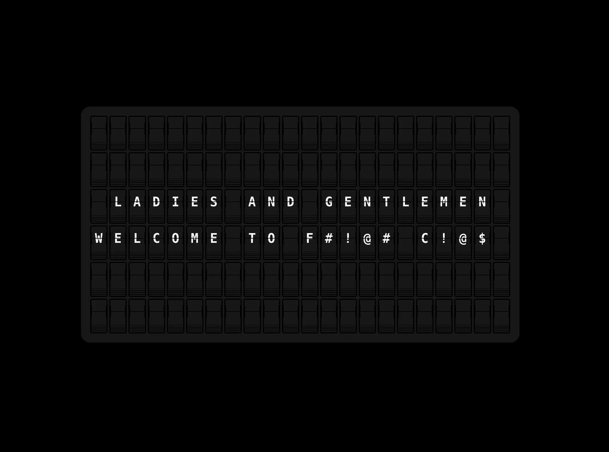
Copy this TSX component source and hand it to an AI coding tool such as Cursor, v0 or Claude, noting it is the Aceternity UI implementation of Text Flipping Board. The tool can then wire it into your React project, and you swap in your own copy, colors and trigger parameters.
Prompt
// components/ui/text-flipping-board.tsx "use client"; import React, { useEffect, useRef, useState, useMemo } from "react"; import { motion } from "motion/react"; import { cn } from…
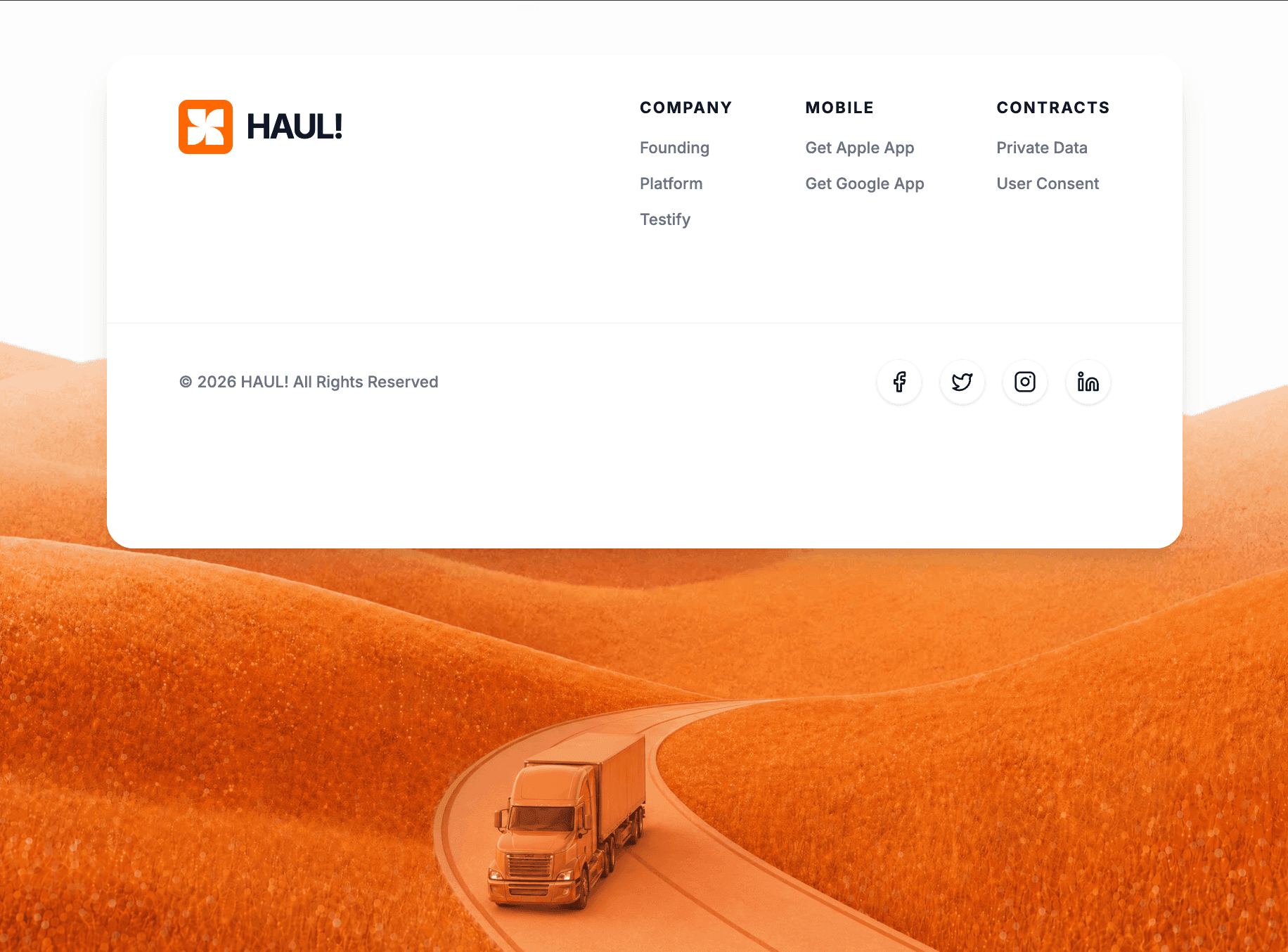
Brand footer as a React function component, with Tailwind, motion/react and lucide-react and font weights fixed in the config. It shows that a footer can also have layered motion.
Prompt
Build a React functional component using Tailwind CSS, `motion/react` for animations, and `lucide-react` for icons. **1. Typography & Setup:** - Import the "Inter" font from Google Fonts…